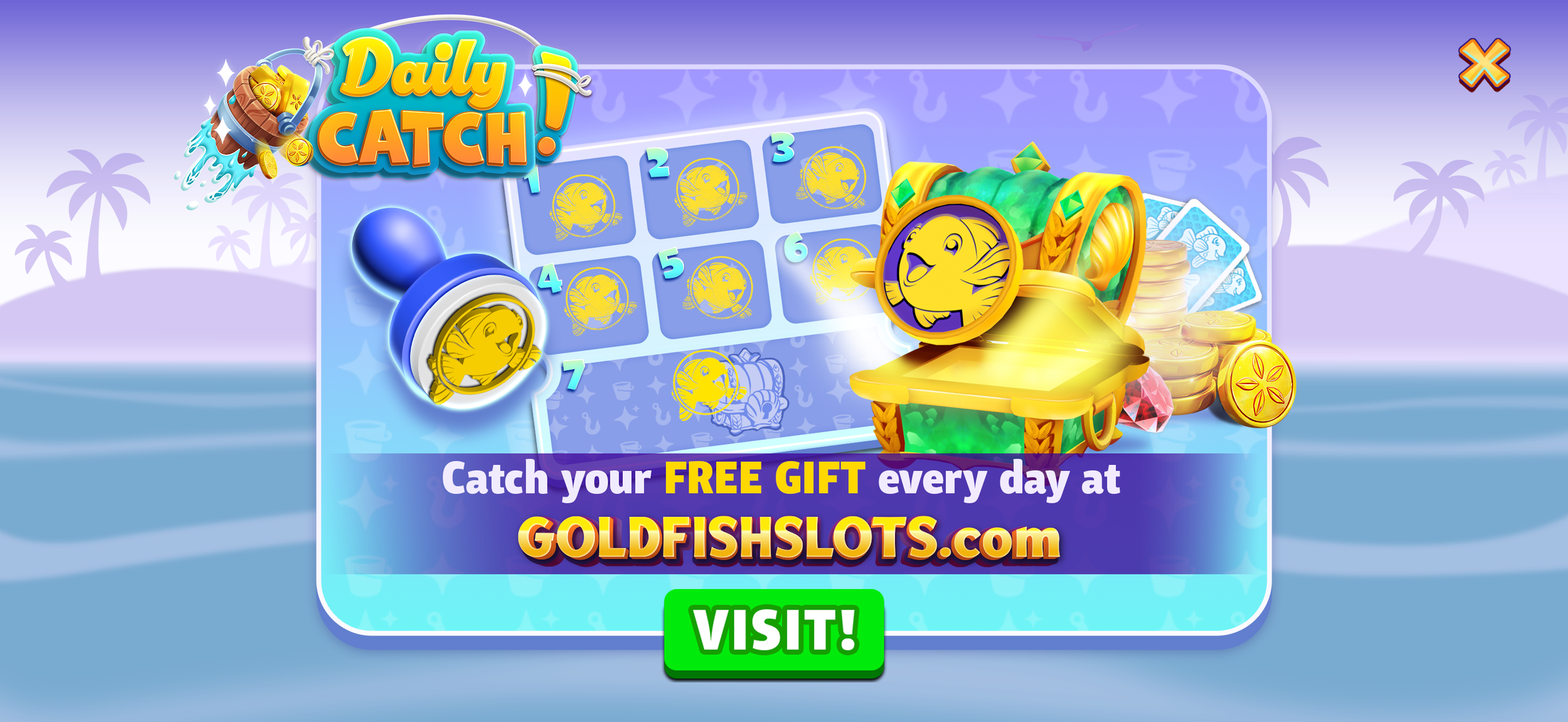
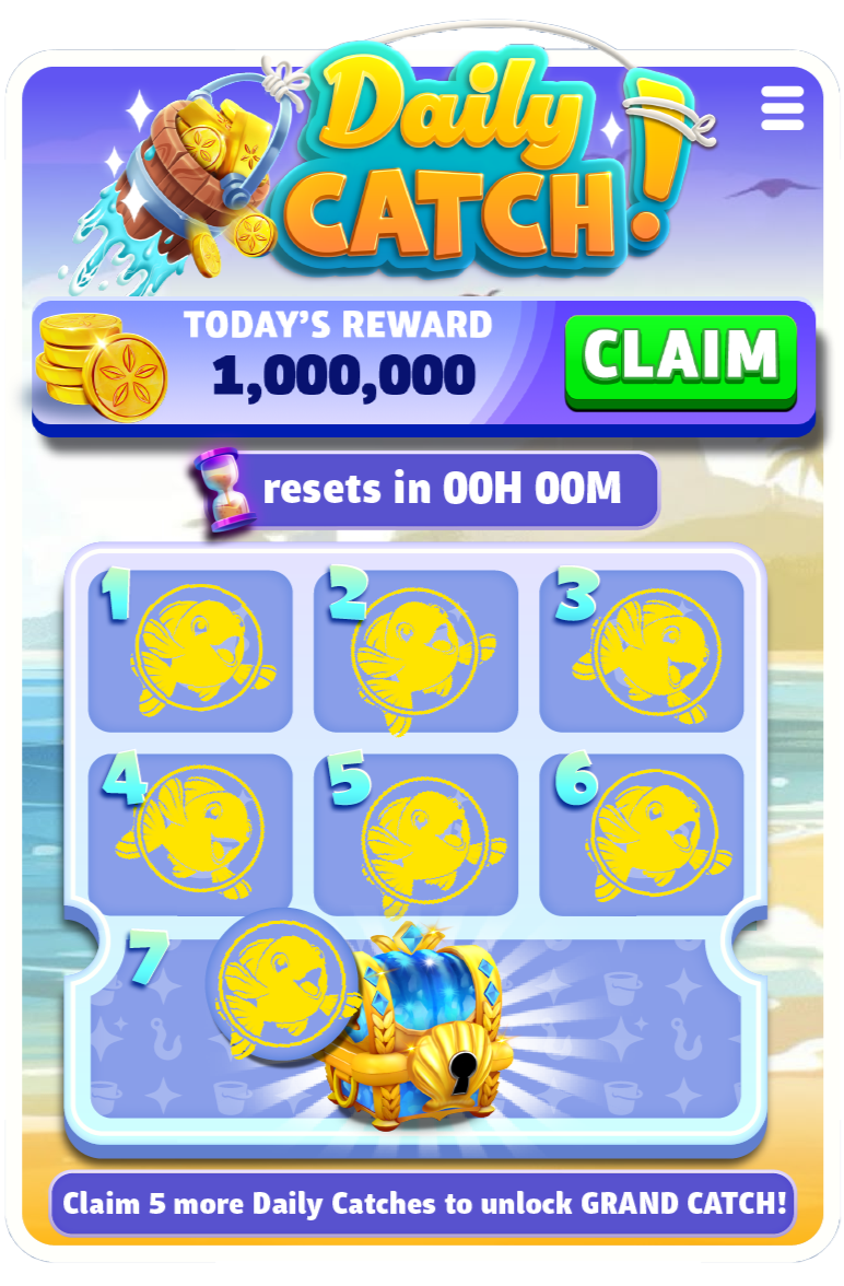
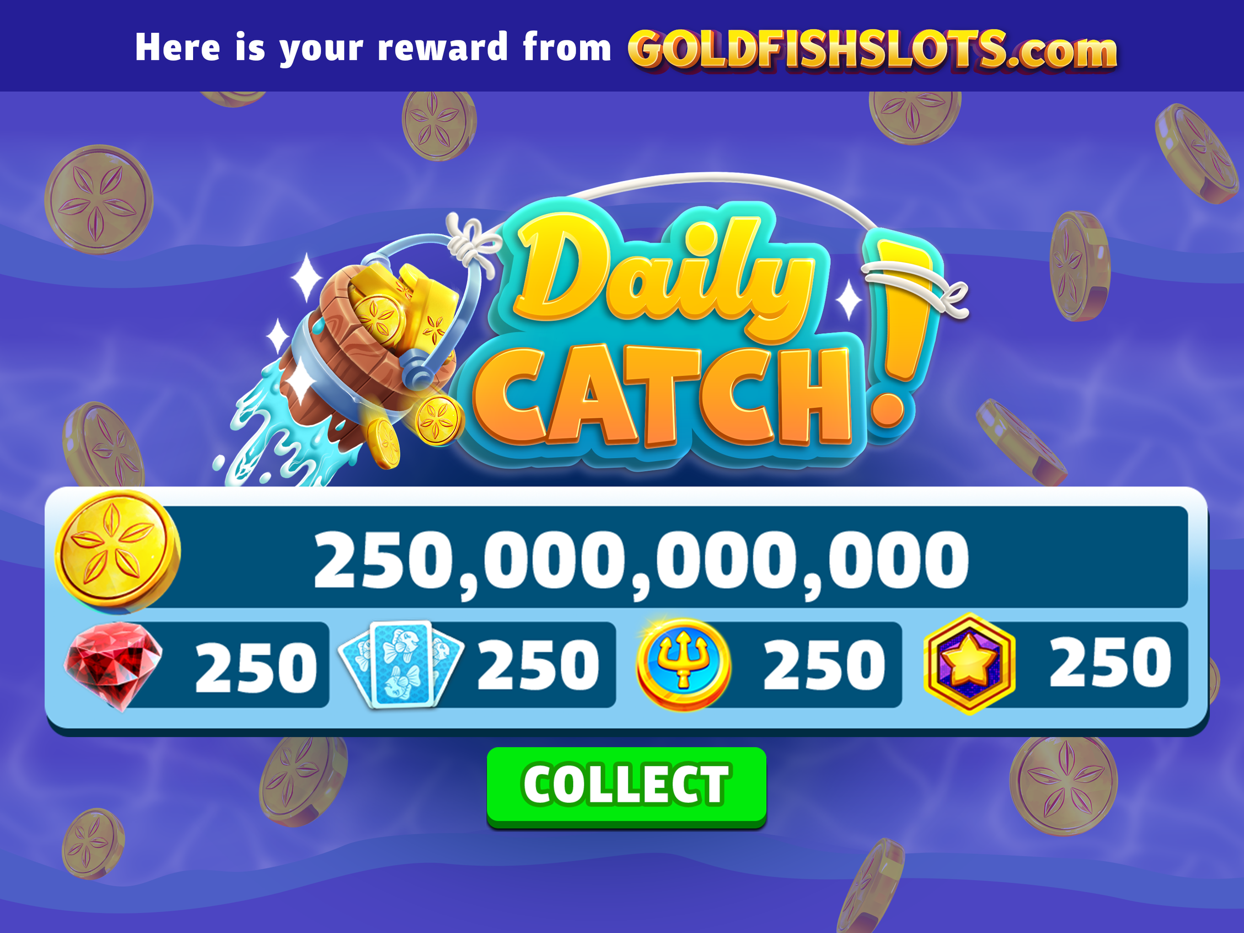
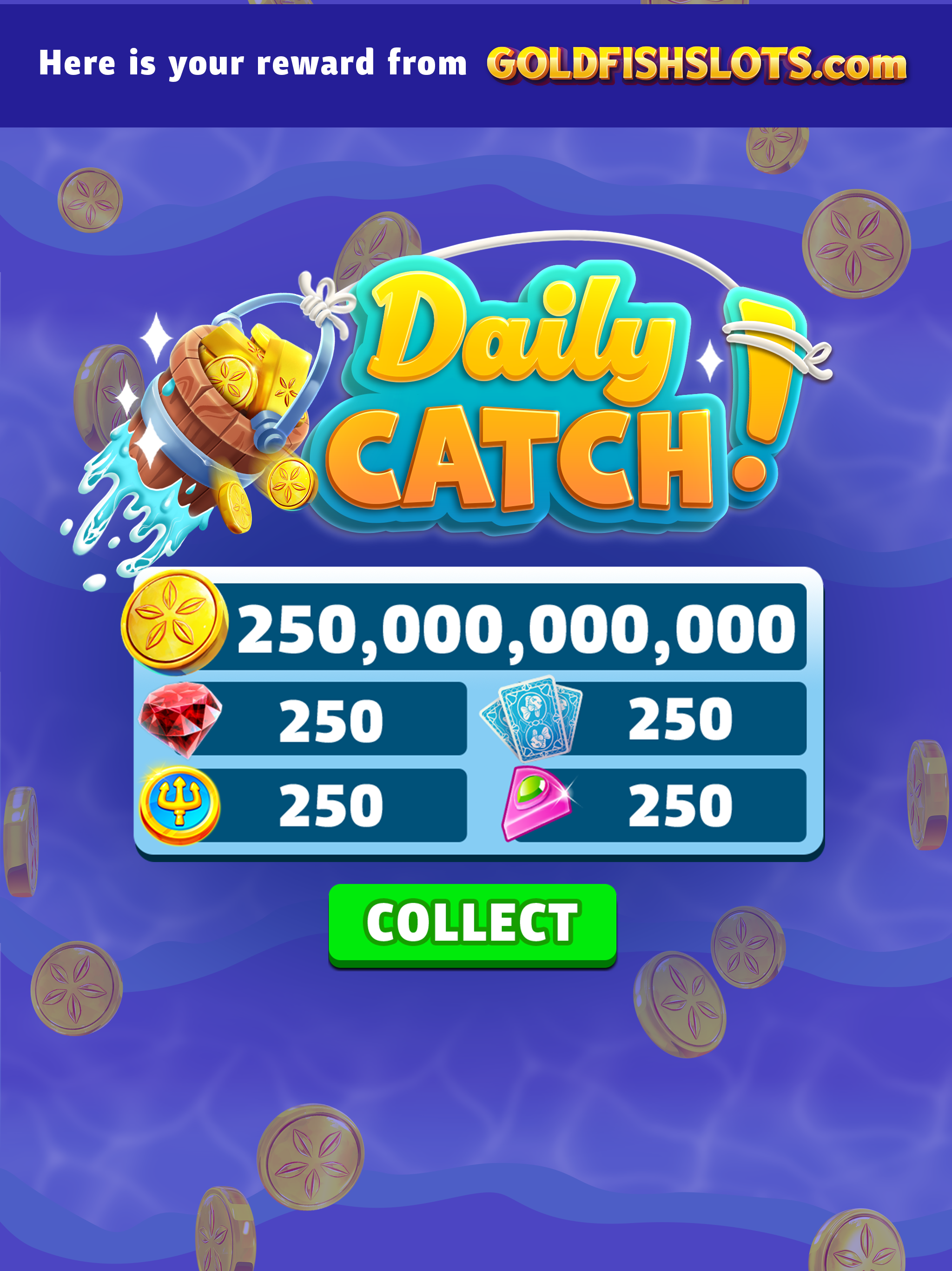
FEATUREDAILY CATCH is a habit-forming daily login system that rewards players with currency, items, and boosts; packaged as a satisfying, stamp-able punch card.
Tools
Adobe Illustrator
Adobe Photoshop
Figma
Blender
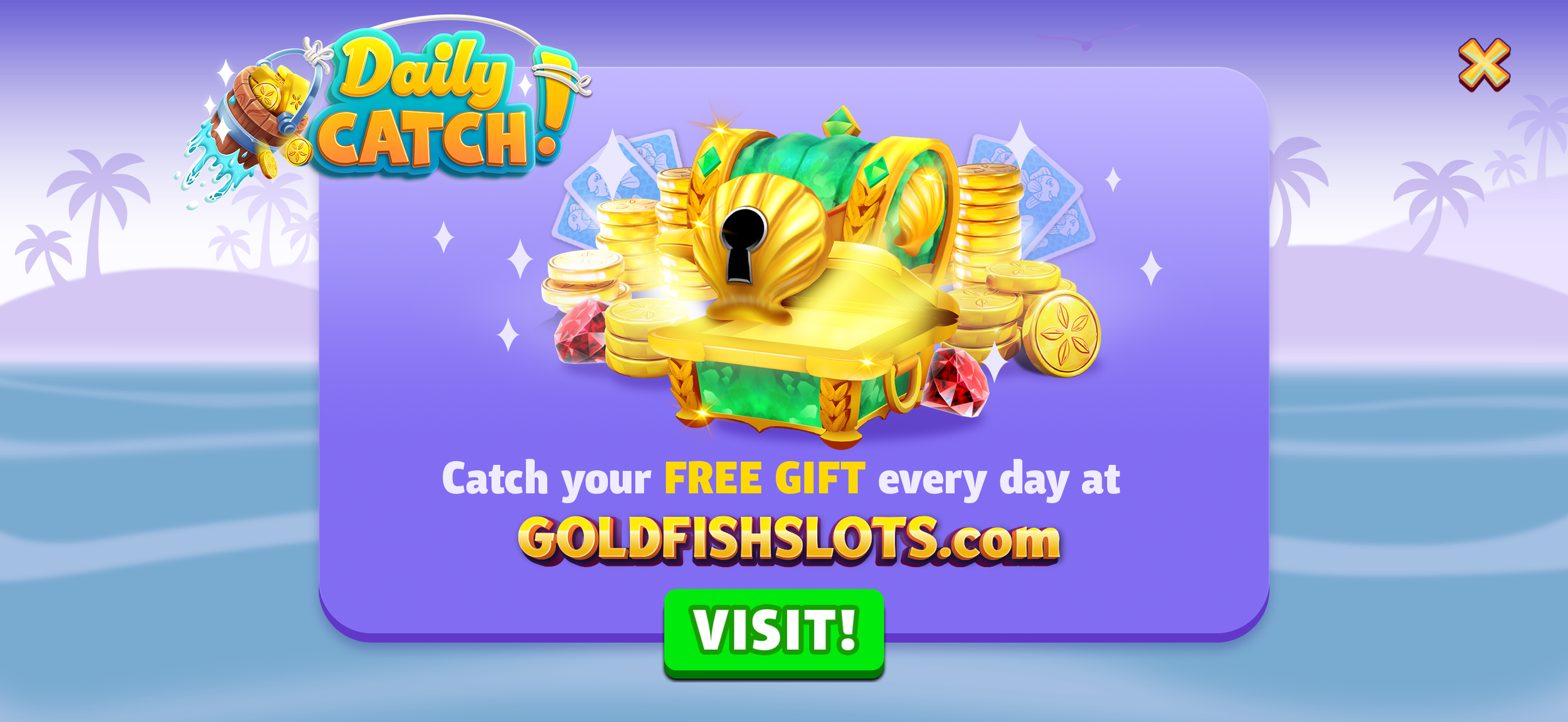
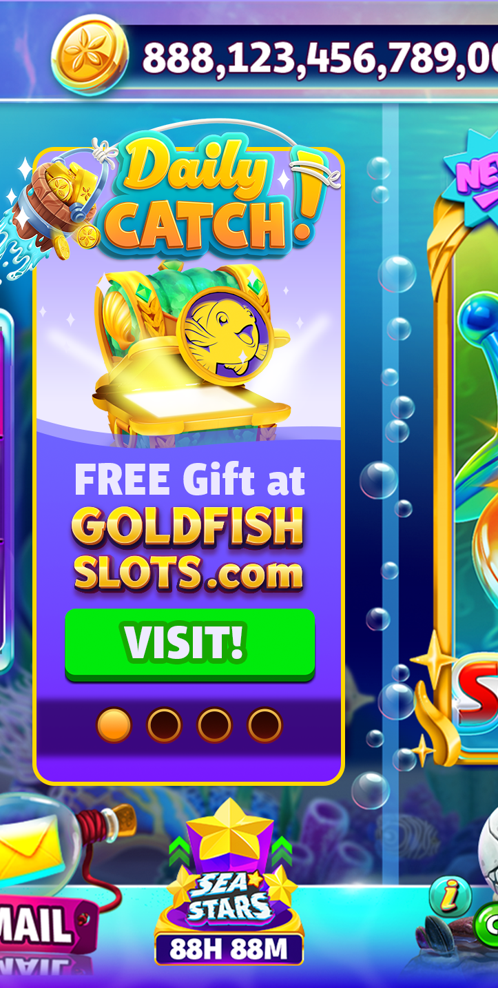
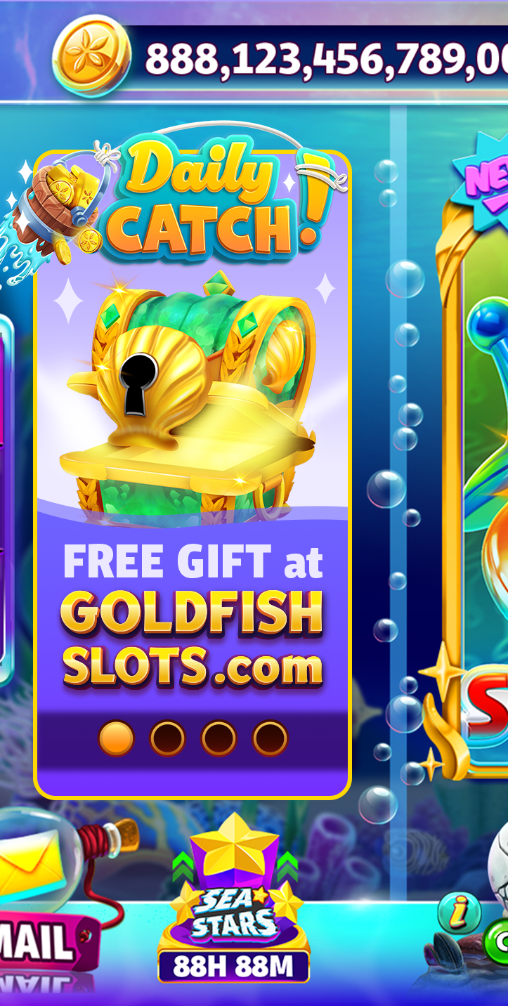
The Gold Fish Direct-to-Consumer (DTC) web store had lower player trust and engagement compared to the in-app store, limiting its adoption rate. The challenge was to encourage repeat interactions and trust in the DTC web store in a way that felt rewarding, low-friction, and aligned with the Gold Fish’s brand.
Players were hesitant to visit or transact on the web, deterring first-time conversion and long-term retention.
PROBLEMDesign a feature with a daily login reward system for the DTC web store that grants players a free, randomized gift (currency, items, boosts) each day. Framed as a collectible, punch card-inspired ritual, the feature turns routine logins into moments of anticipation and delight - balancing instant gratification with a progression path toward a grand reward.
The punch card system quietly shifts DTC visits from being a hesitant purchase decision to a no-risk, habit-forming daily ritual.
SOLUTIONLead UI/UX Designer - responsible for the end-to-end design of the features within the team - wireframing, branding, and final asset hand-off. I collaborated with Leadership, Product, Engineering, and QA teams to concept, iterate, and refine the feature.
ROLETOOLS
Adobe Illustrator
Adobe Photoshop
Figma
Blender
TIMELINE
6 weeks
PROJECT
OVERVIEW
0102030405User flows & Wireframes
01
USER FLOWS
WIREFRAMES
GRAYBOX
KEY SCREENS & COMPONENTS
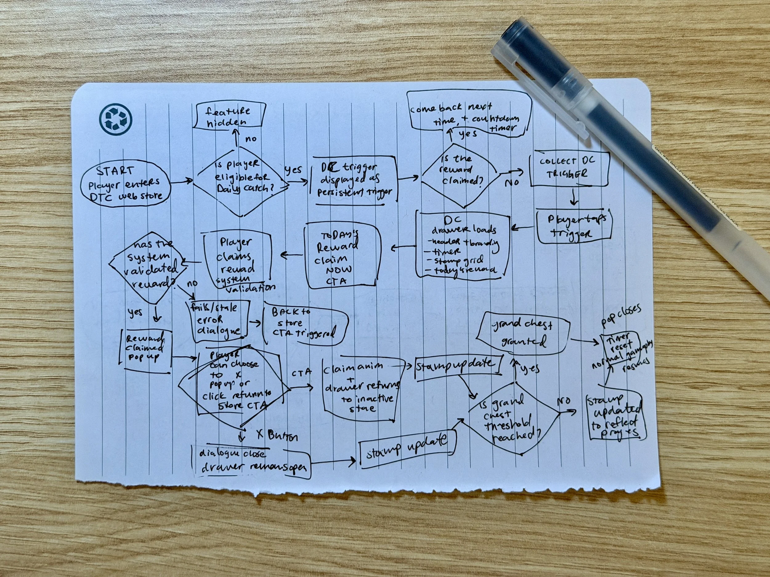
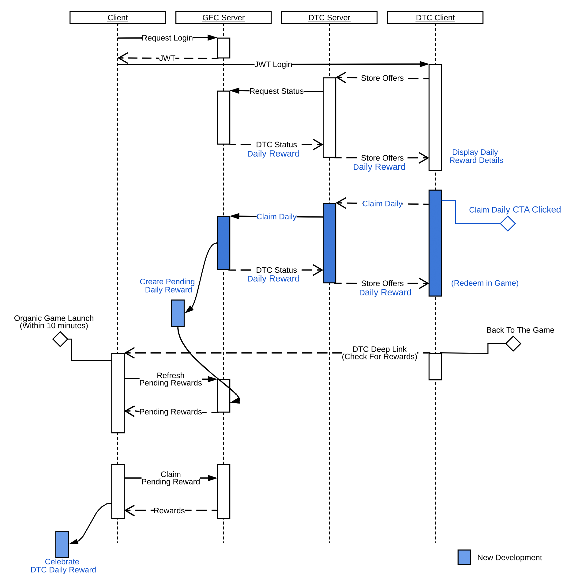
To kick off the design process, I drew a detailed user flow that outlined how players could interact with the Daily Catch feature across various states per the product spec. This ensured I captured all necessary key moments and screens before moving into wireframing. It also allowed me to preemptively notice points that could become moments of delight. I then cross-checked the flow against the engineering team’s flow diagram from their technical design document to align on the exact interactions I would be designing towards.
INITIAL USER FLOWS
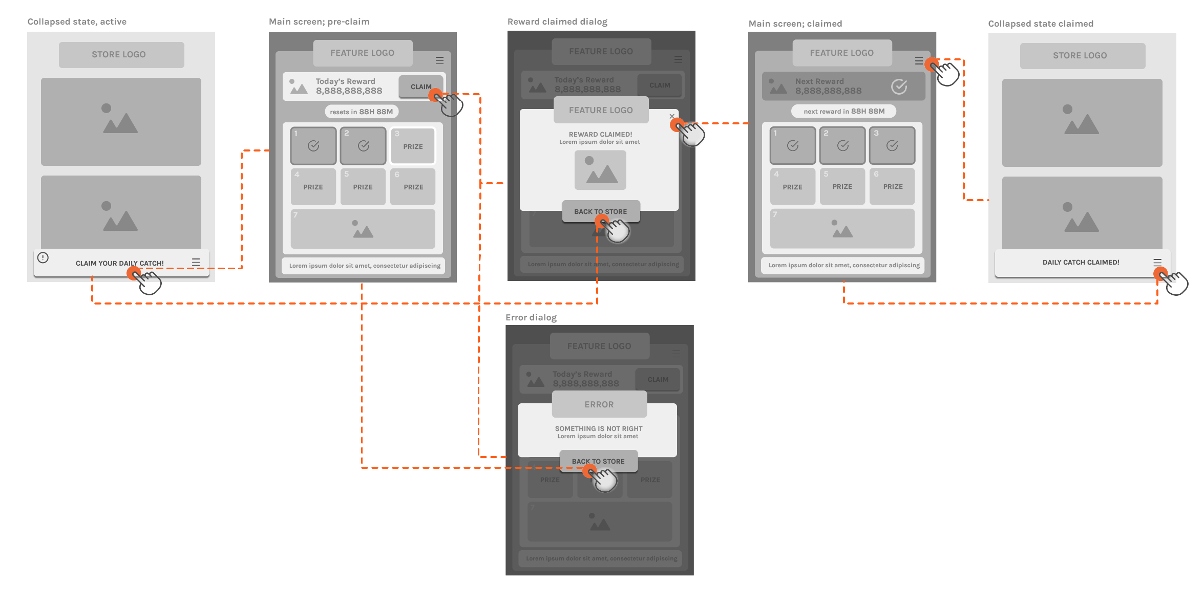
KEY SCREENS & COMPONENTS
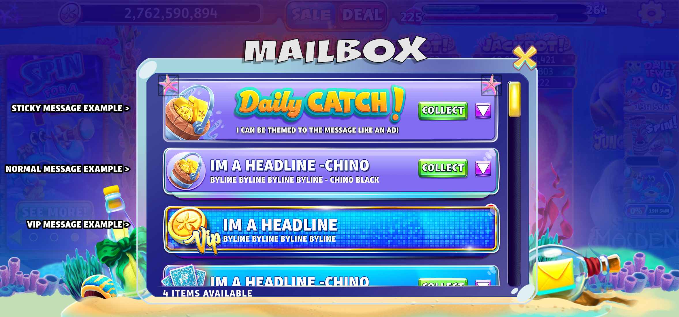
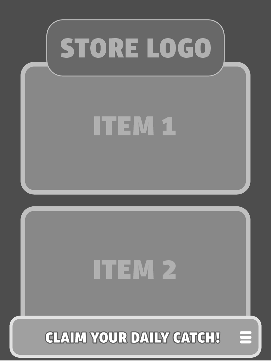
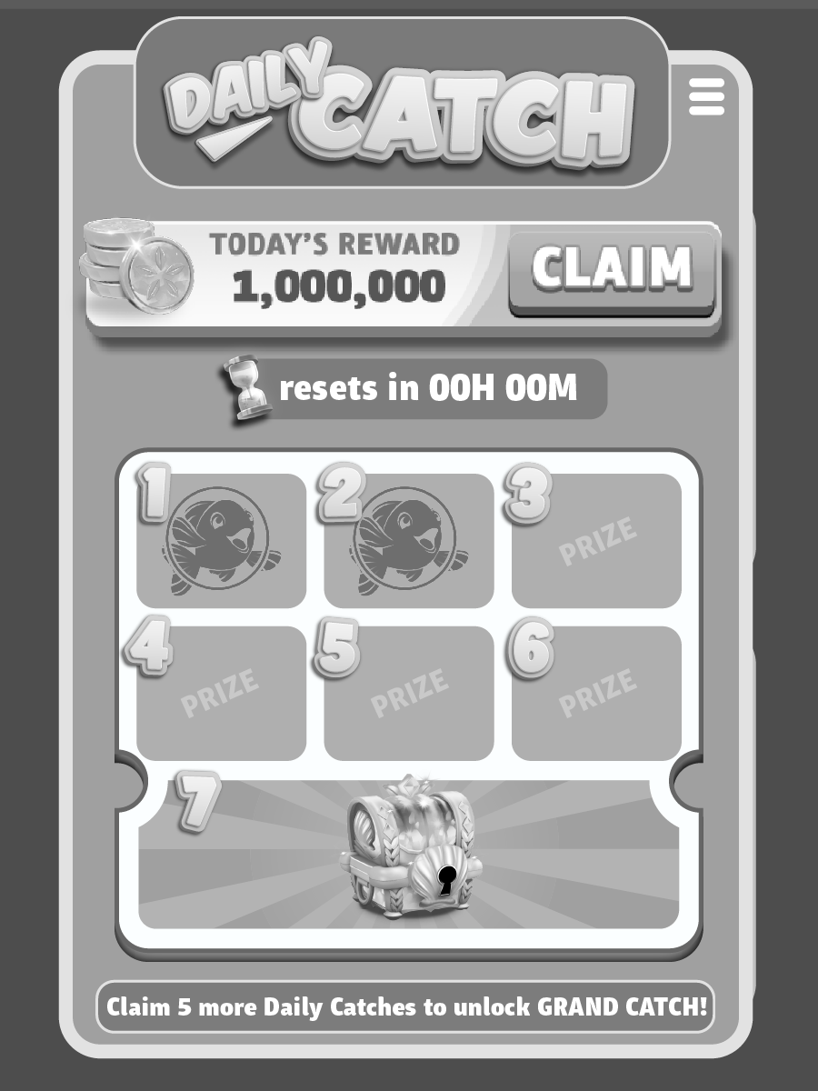
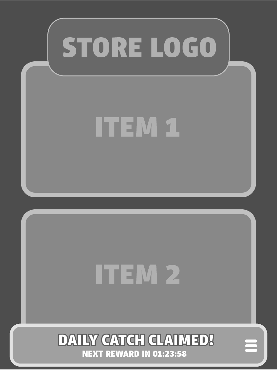
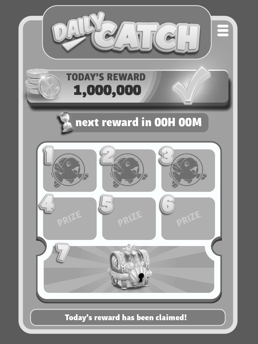
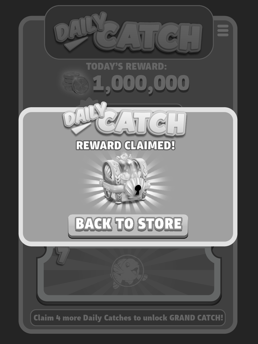
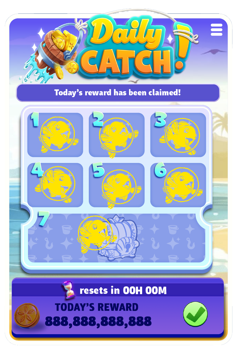
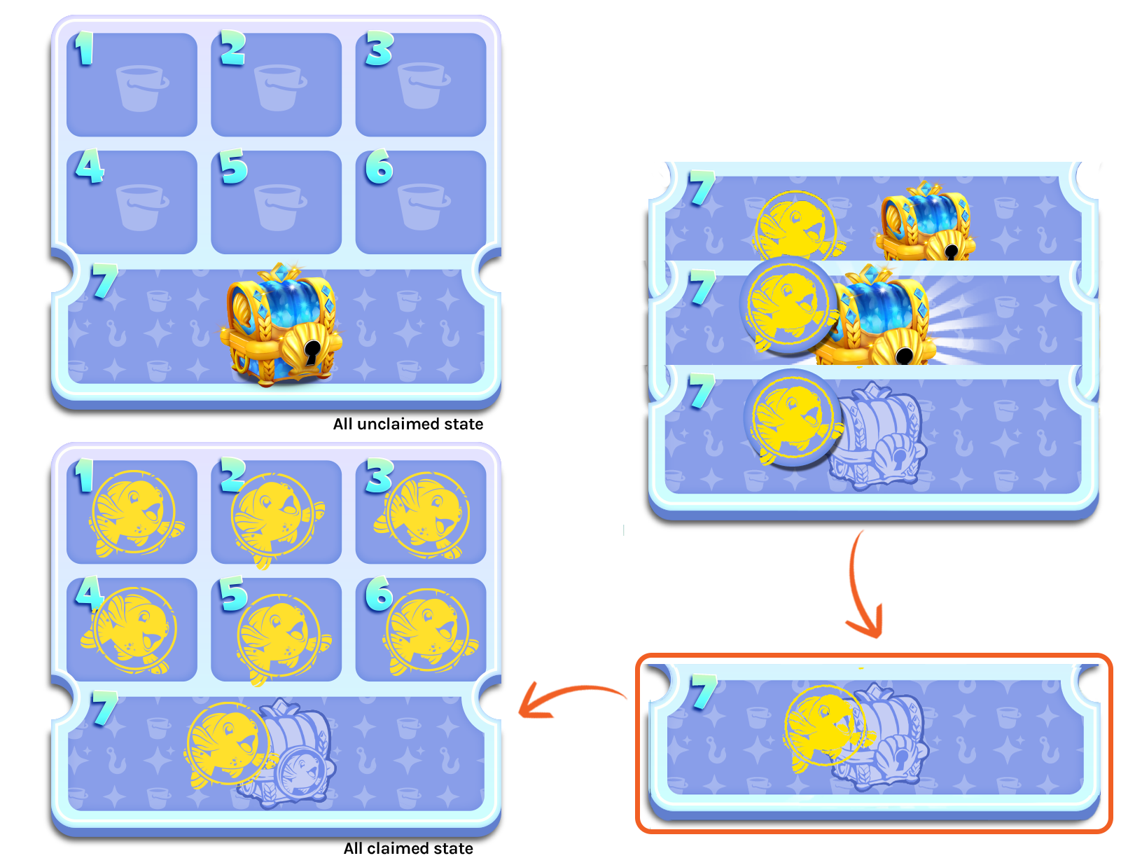
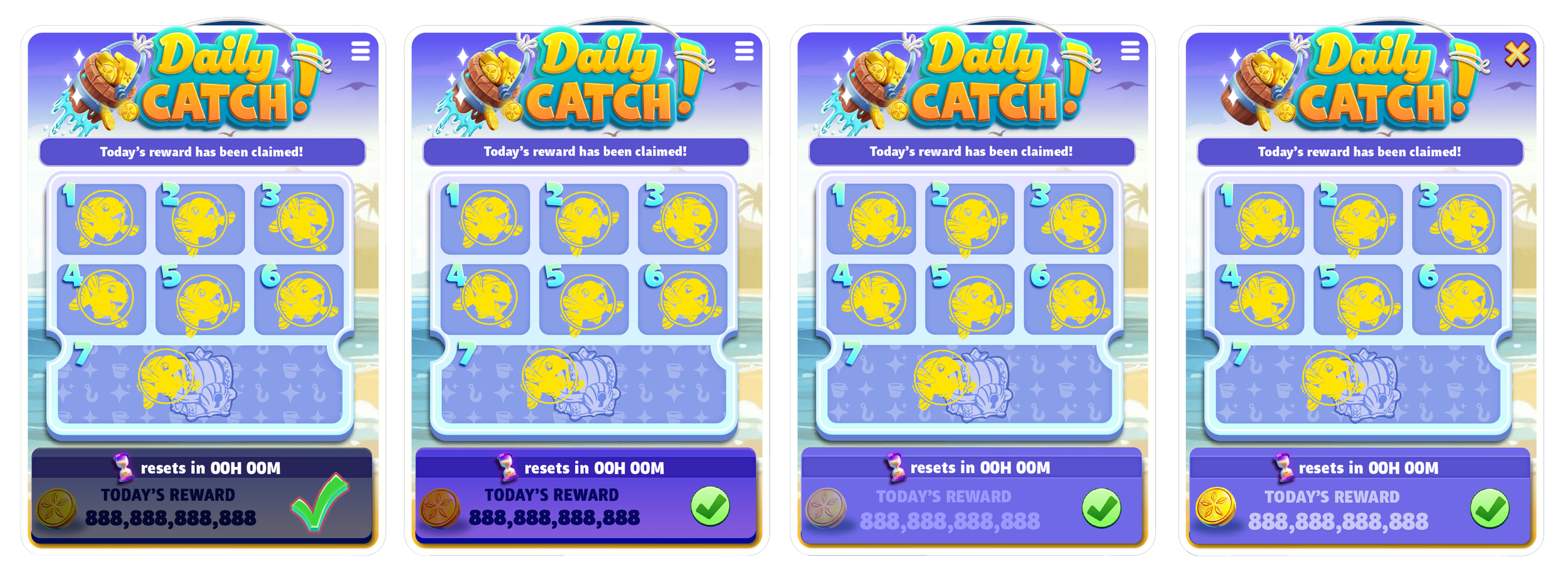
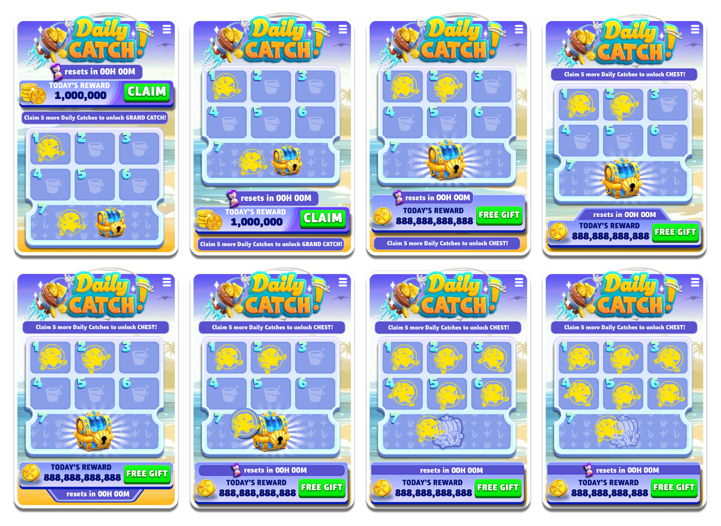
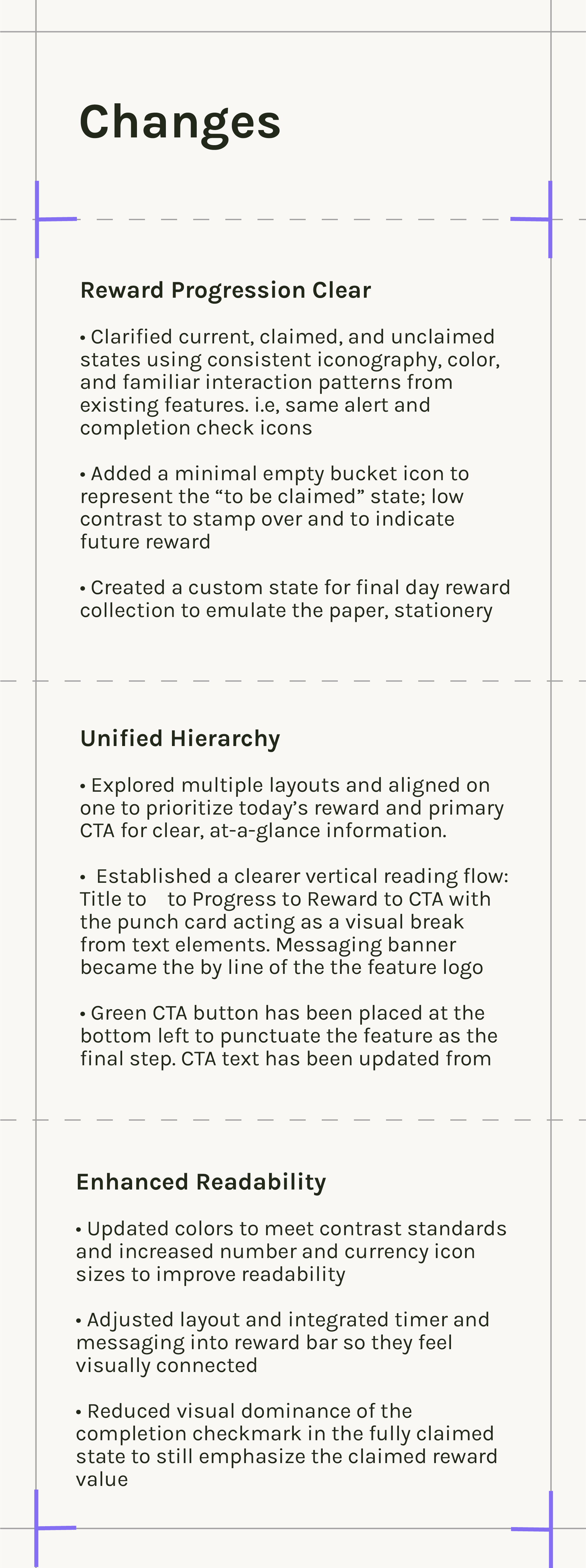
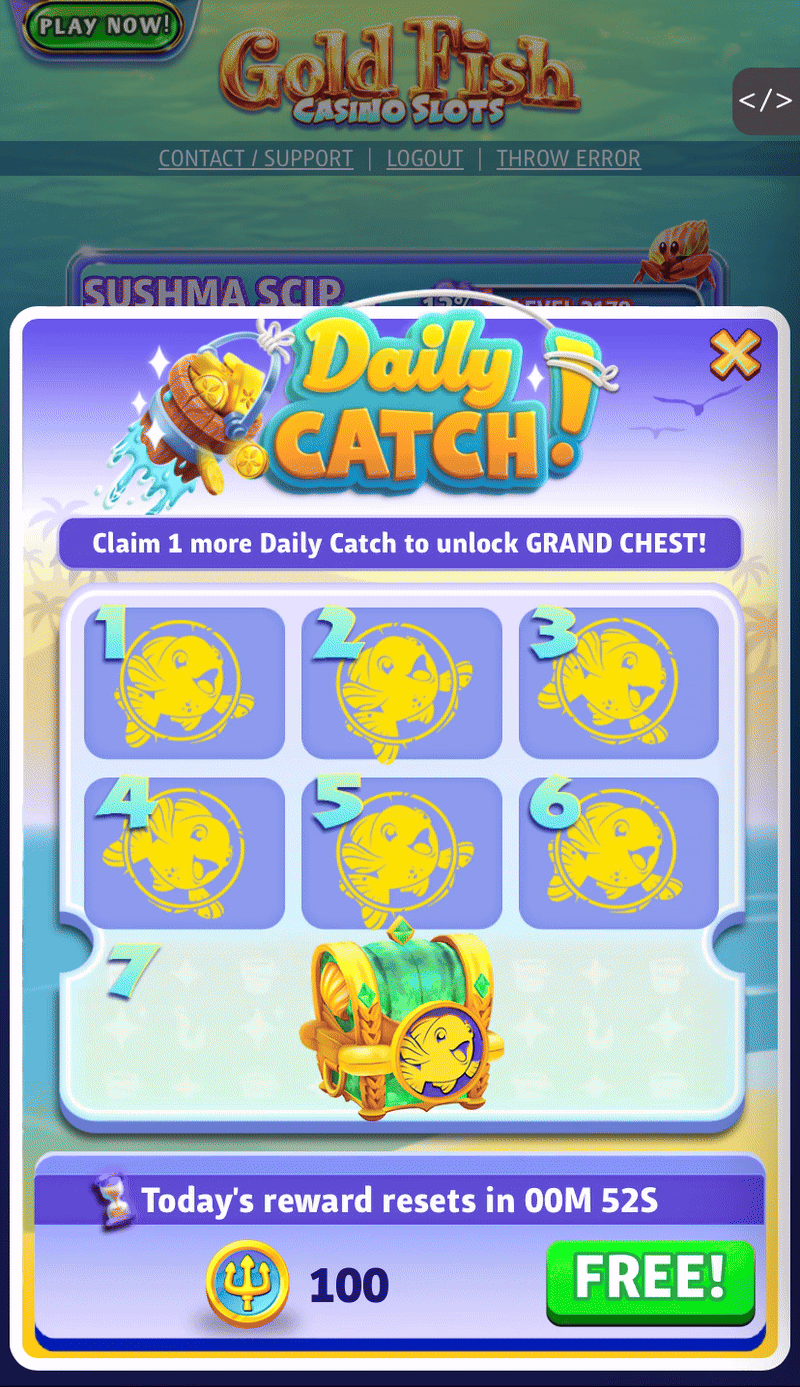
Calendar Drawer (Main Screen)
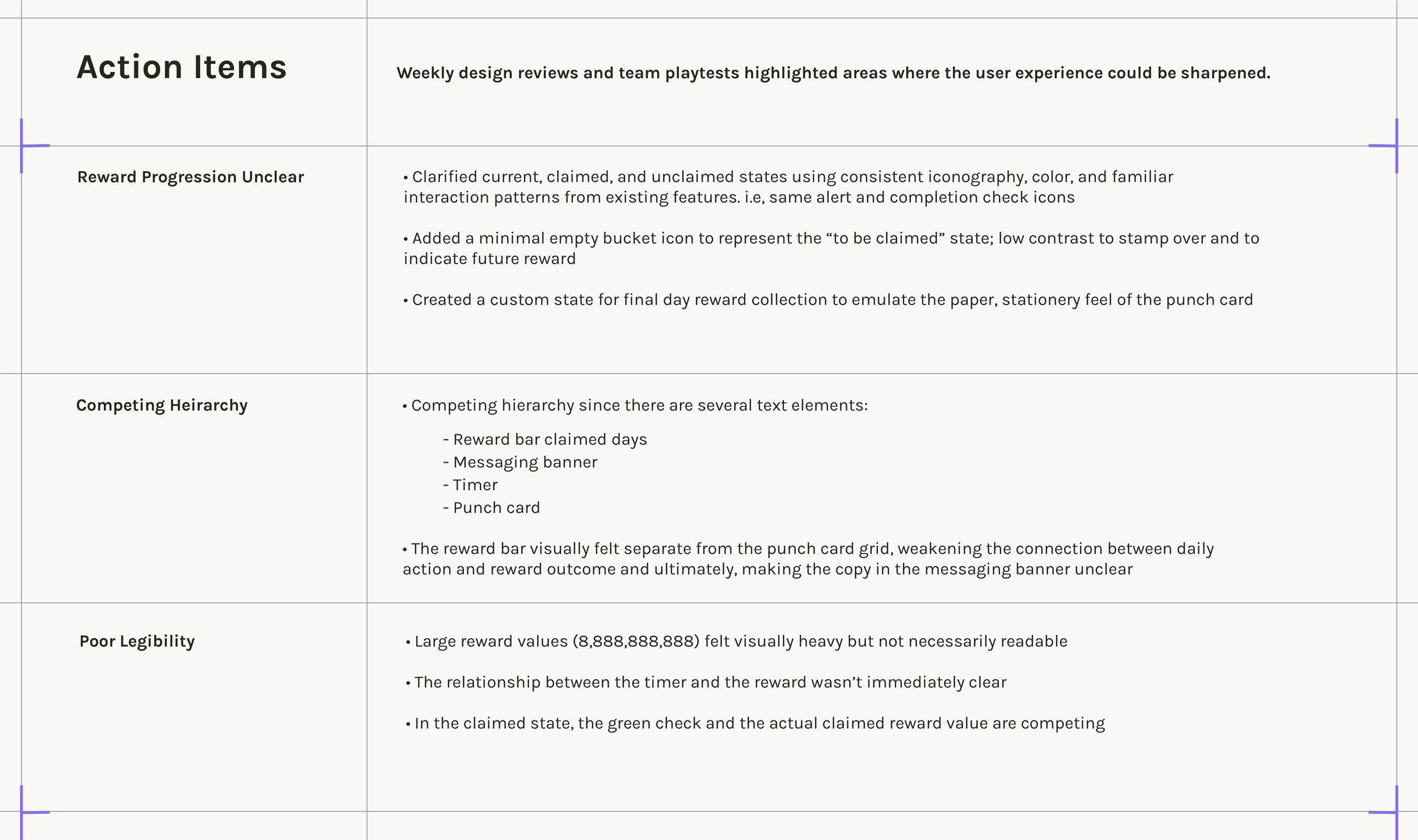
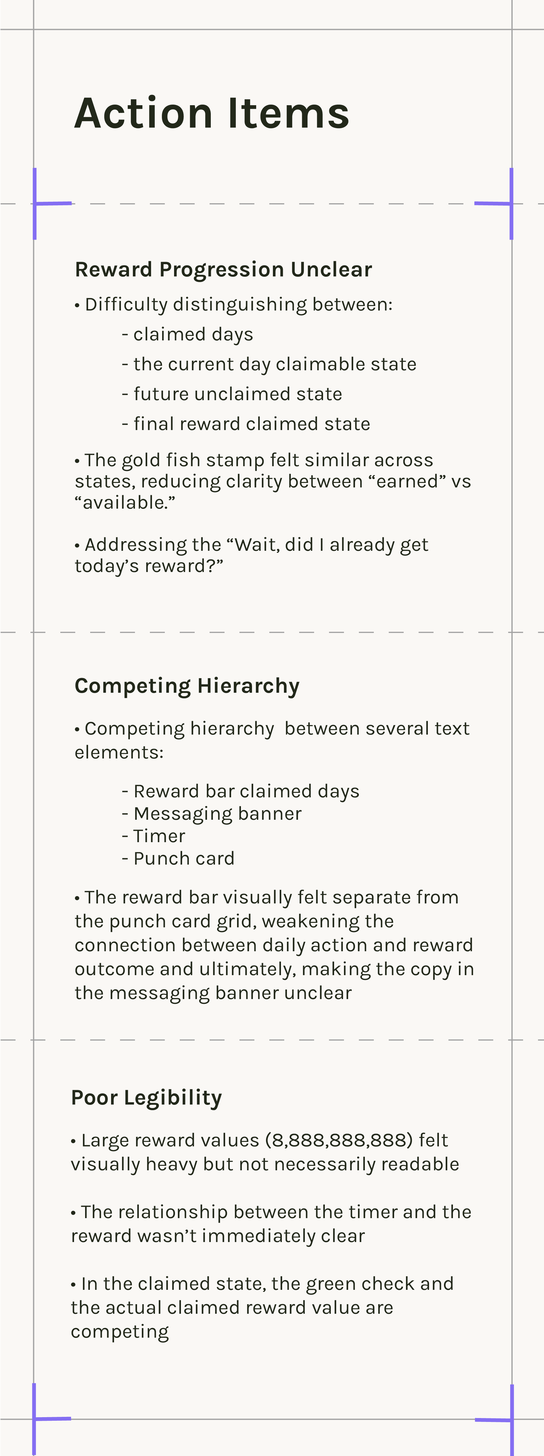
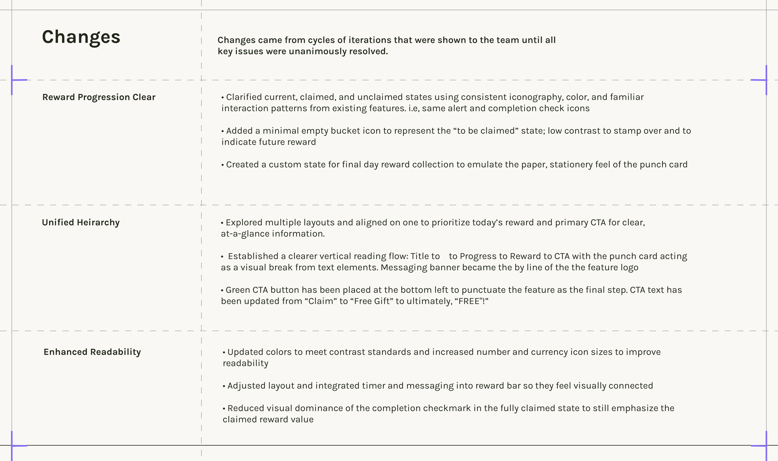
• Claimed (inactive, collapsed) and unclaimed (active, open) states. Clear status messaging (“Collect your Daily Catch” and countdown timer) to remove ambiguity
• Timer, body copy, CTA button, currency icon, and calendar in a legible, at-a-glance layout
• Copy to inform user when next reward is available to avoid confusion around eligibility
• Progress/Milestones with clear visuals to show short and long-term rewards
• Landscape and portrait mode support
• Branding
• Multi-currency layout (if grand chest is redeemable)
• Seamless Web-to-App messaging and CTA
• Branding
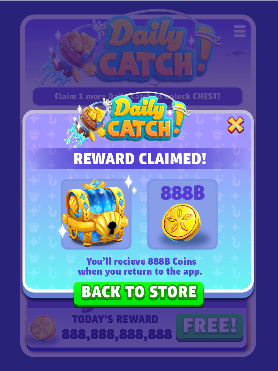
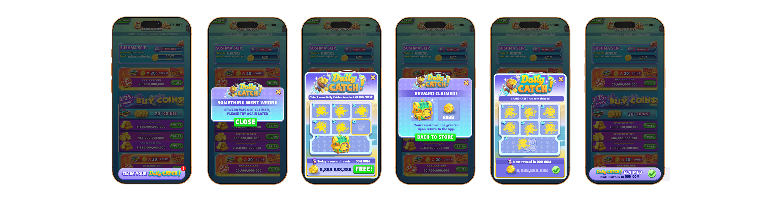
Reward Claim Popup (Modal)
• CTA button to help user navigate back to store to alleviate friction and resume normal gameplay
• Branding
Error Message Popup (Modal)
FINAL USER FLOW
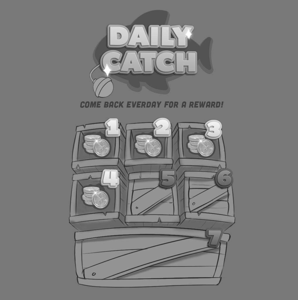
Low-fidelity wireframes to explore flow, noting crucial touch points, and optimizing for portrait mode. The design uses a bottom-drawer interaction modeled after an existing, well-understood pattern found in other parts of the Goldfish ecosystem. Space has been allocated for a countdown timer and accompanying body copy to clearly communicate when the next reward is available.
LOW FIDELITY WIREFRAMES
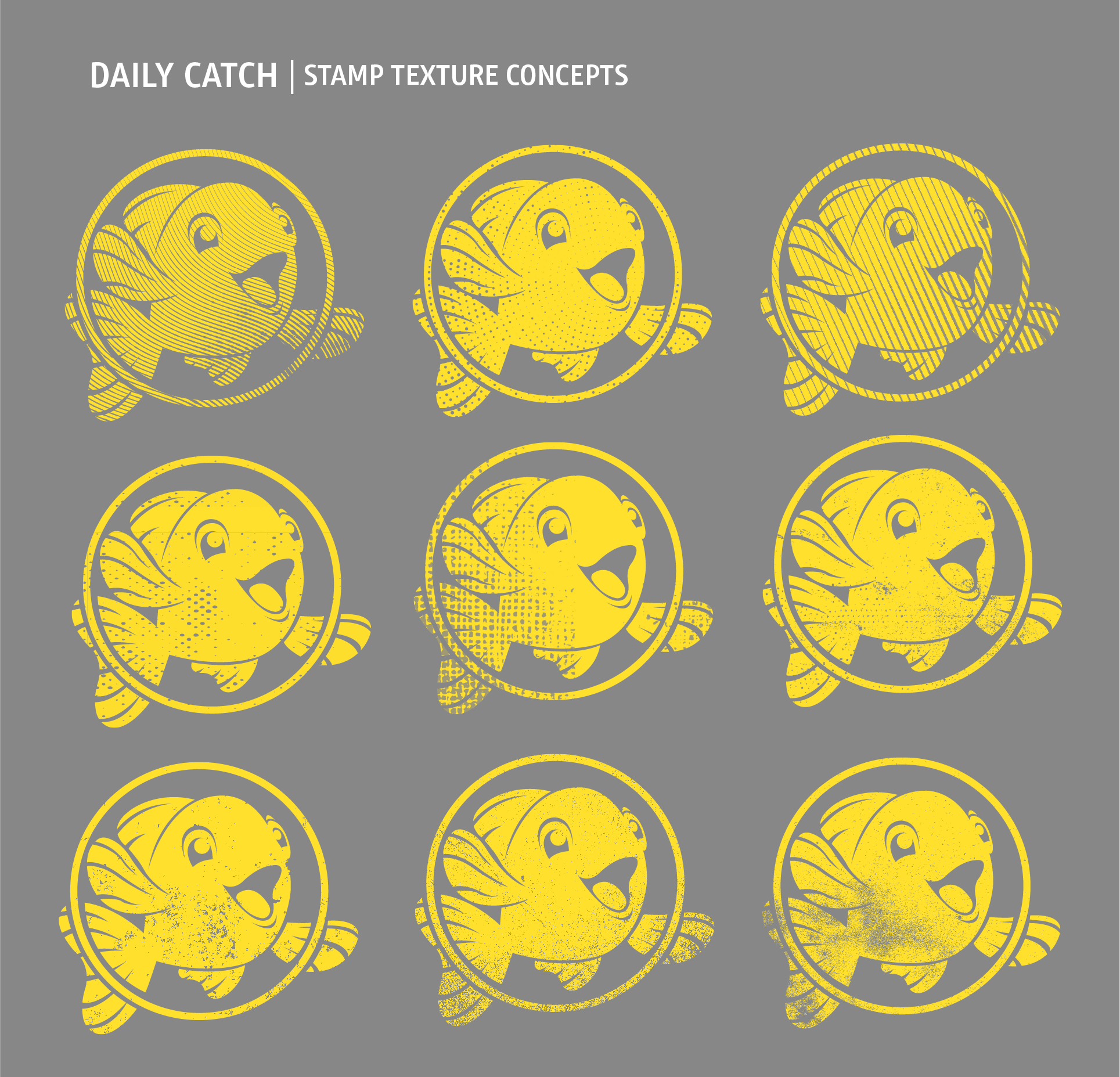
Graybox mockups were created to provide tech artists and engineers with placeholder assets, helping define layout and assess playability while final art is still in development. Existing brand components were incorporated, along with exploratory punch card themes and stamp motifs.
GRAYBOX
MOODBOARD

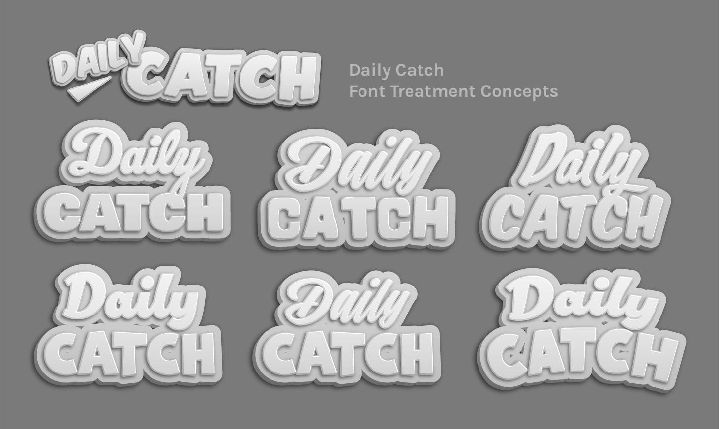
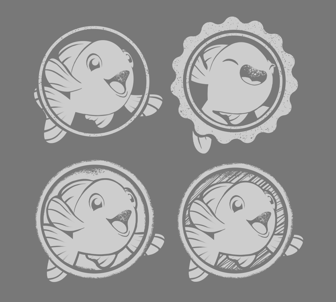
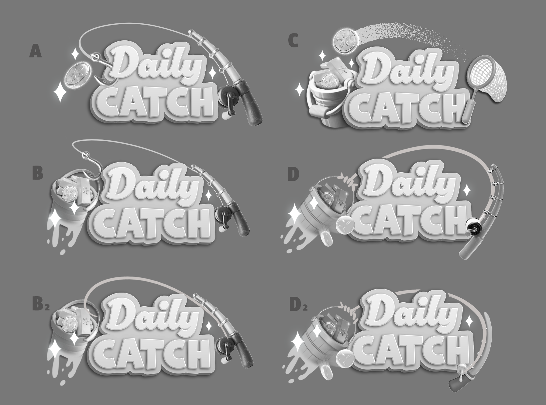
LOGO & ICONOGRAPHY
SKETCHES
While designing the Daily Catch feature, I focused on creating branding that felt native to Gold Fish Casino Slots’ whimsical underwater world. The UI was executed in a flat 2.0 style, aligning with the game-wide visual refresh, while hero imagery leaned into an illustrative style to introduce contrast and depth.
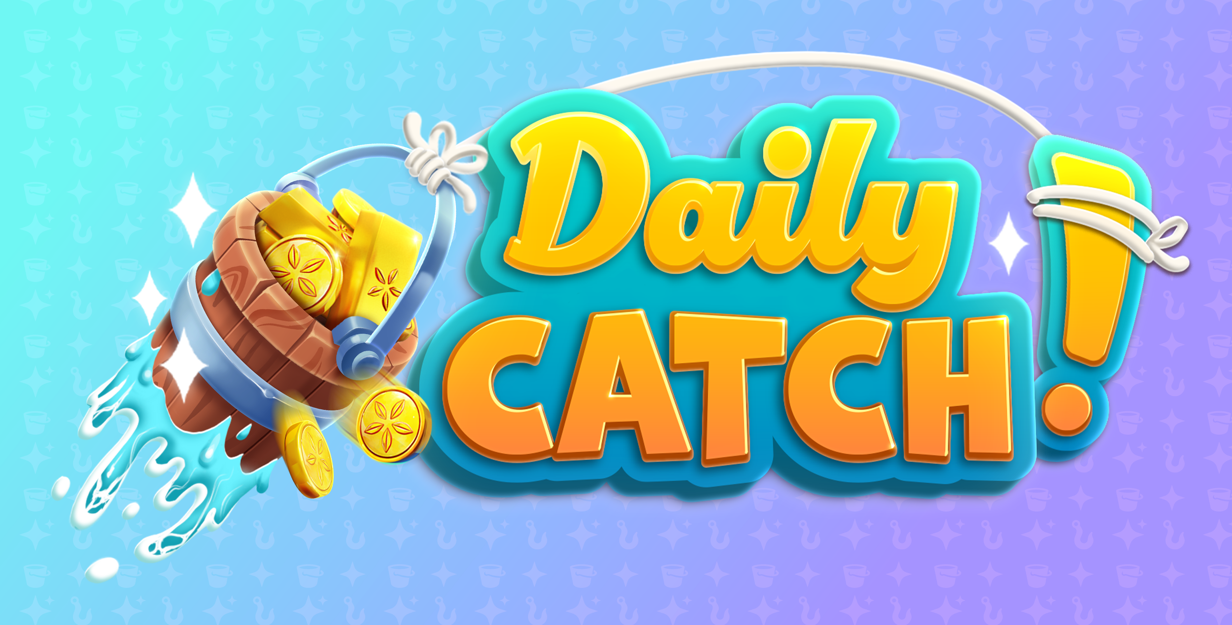
The name Daily Catch was chosen for its limited-time connotation and nautical relevance. Rather than positioning the game’s fish characters as the “catch” (grotesque!), the narrative centers on the daily reward itself as the prize of the day. Think water-drenched buckets pulled fresh from the sea, brimming with gleaming gold coins.
This approach allowed the feature to feel unmistakably Gold Fish while maintaining a clean, UI-forward experience.
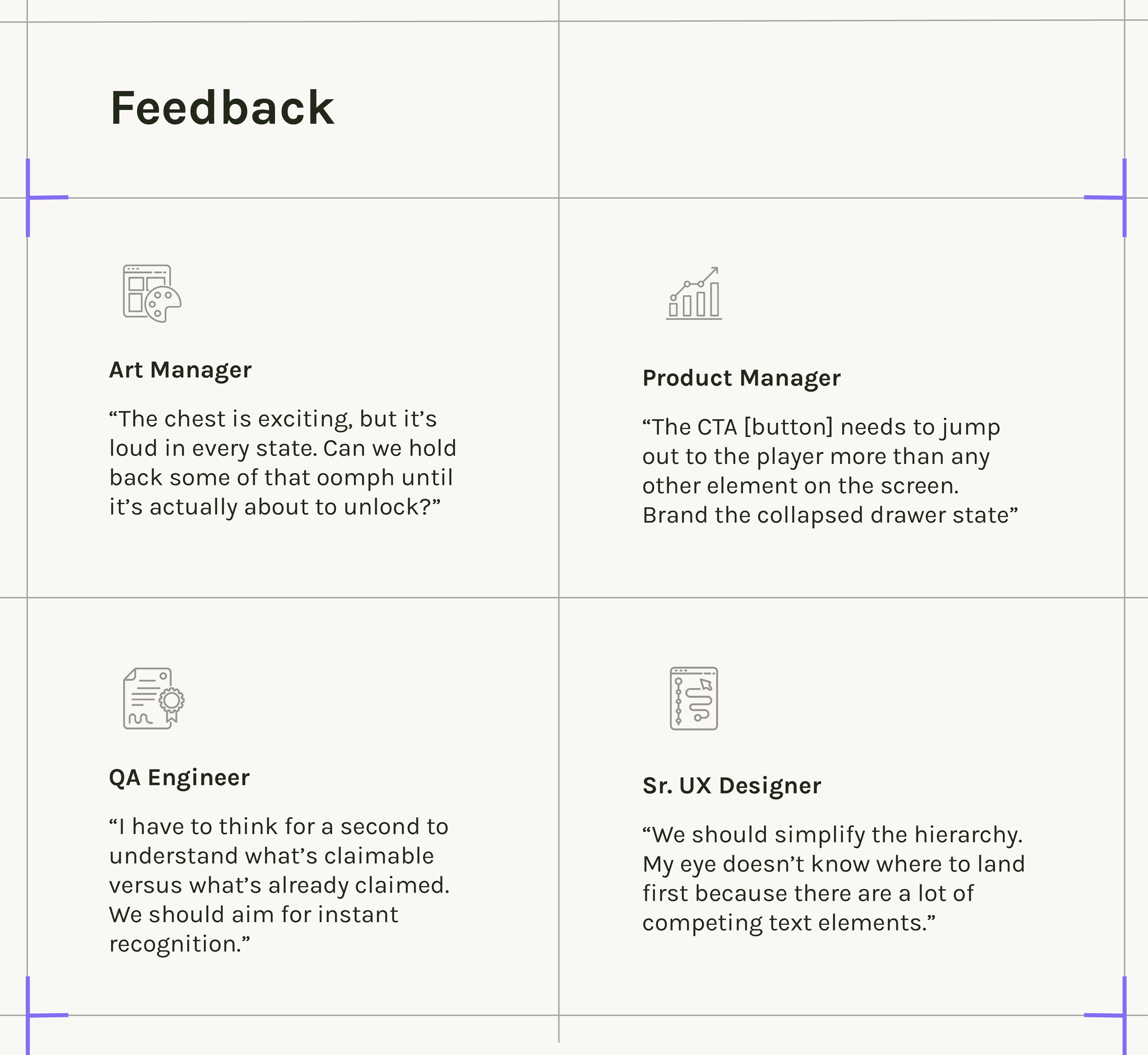
Feedback & Iterations
03
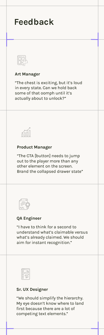
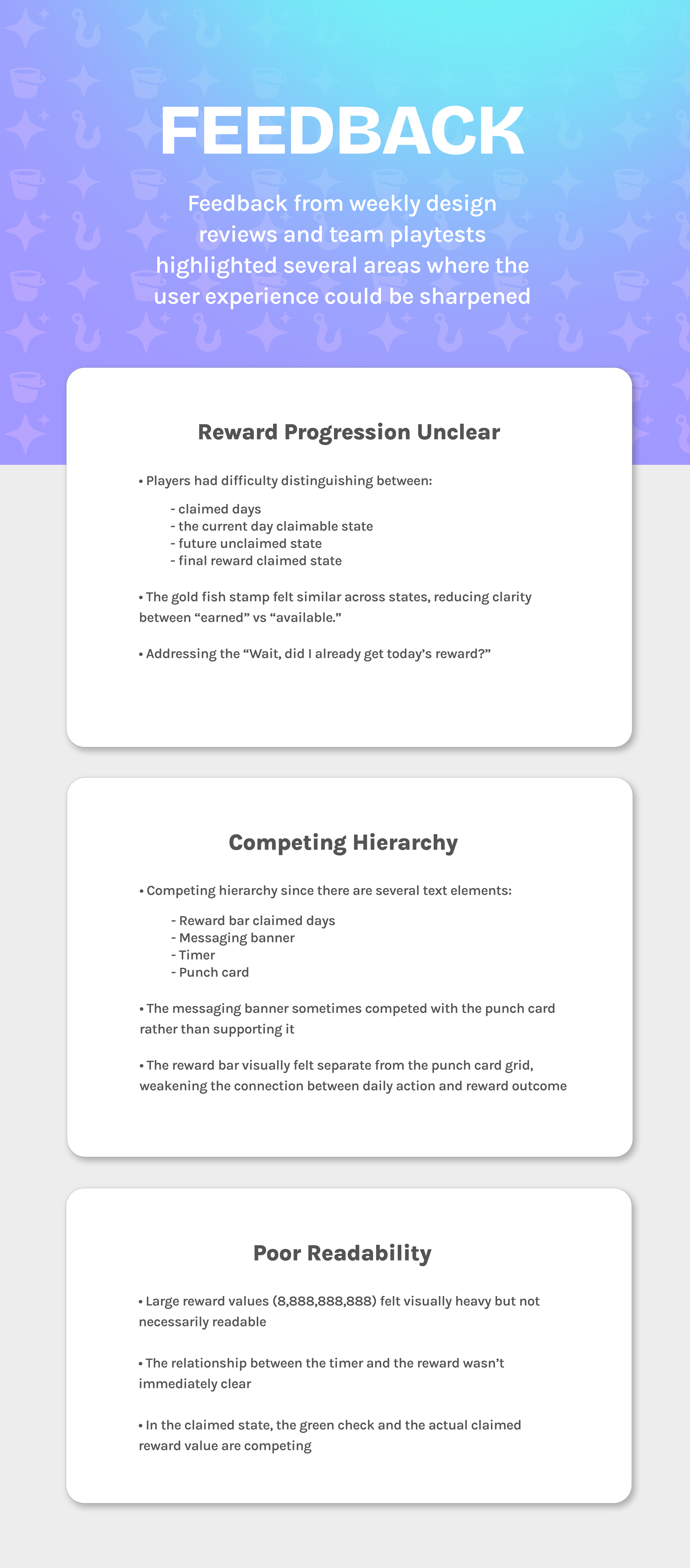
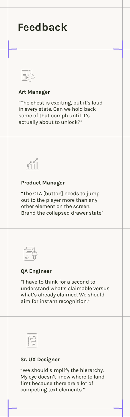
FEEDBACK
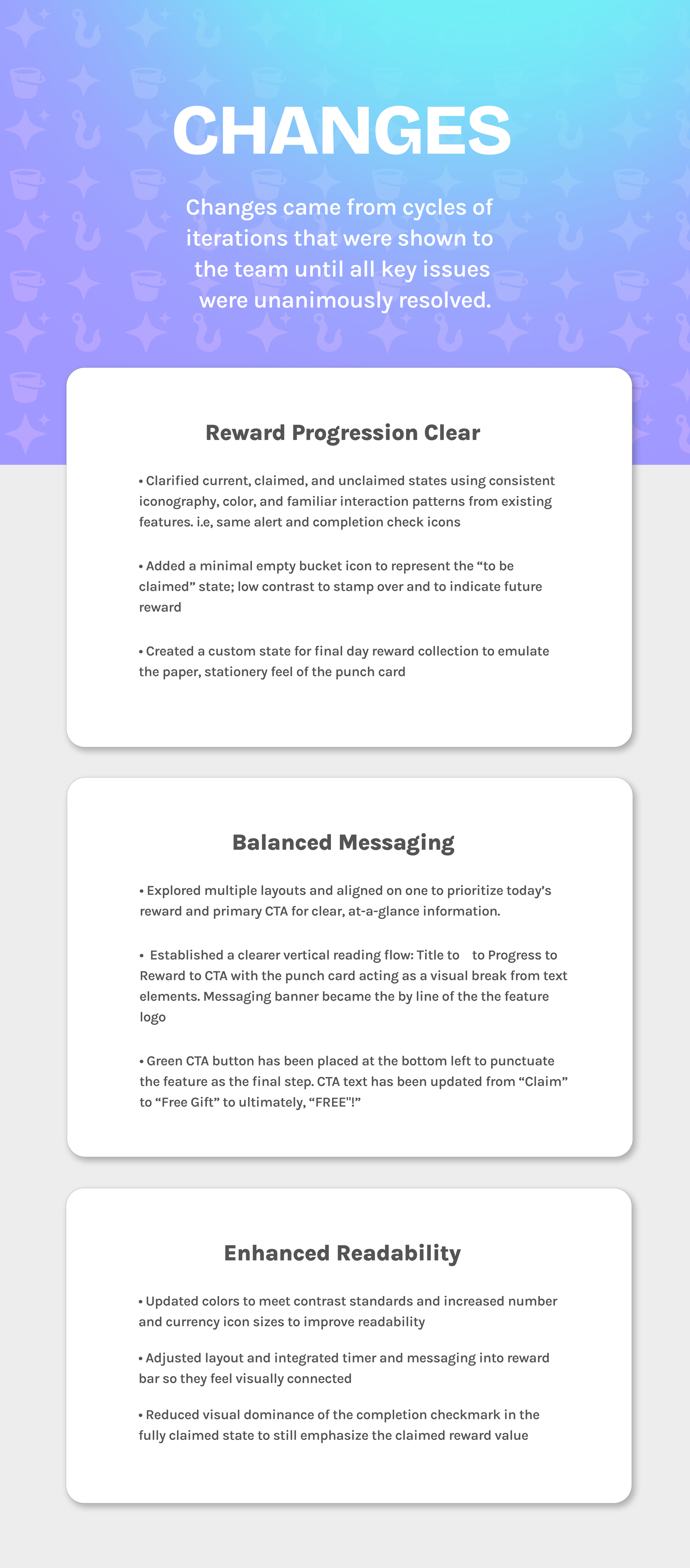
CHANGES
PLAYTESTS
Sample of earlier designs
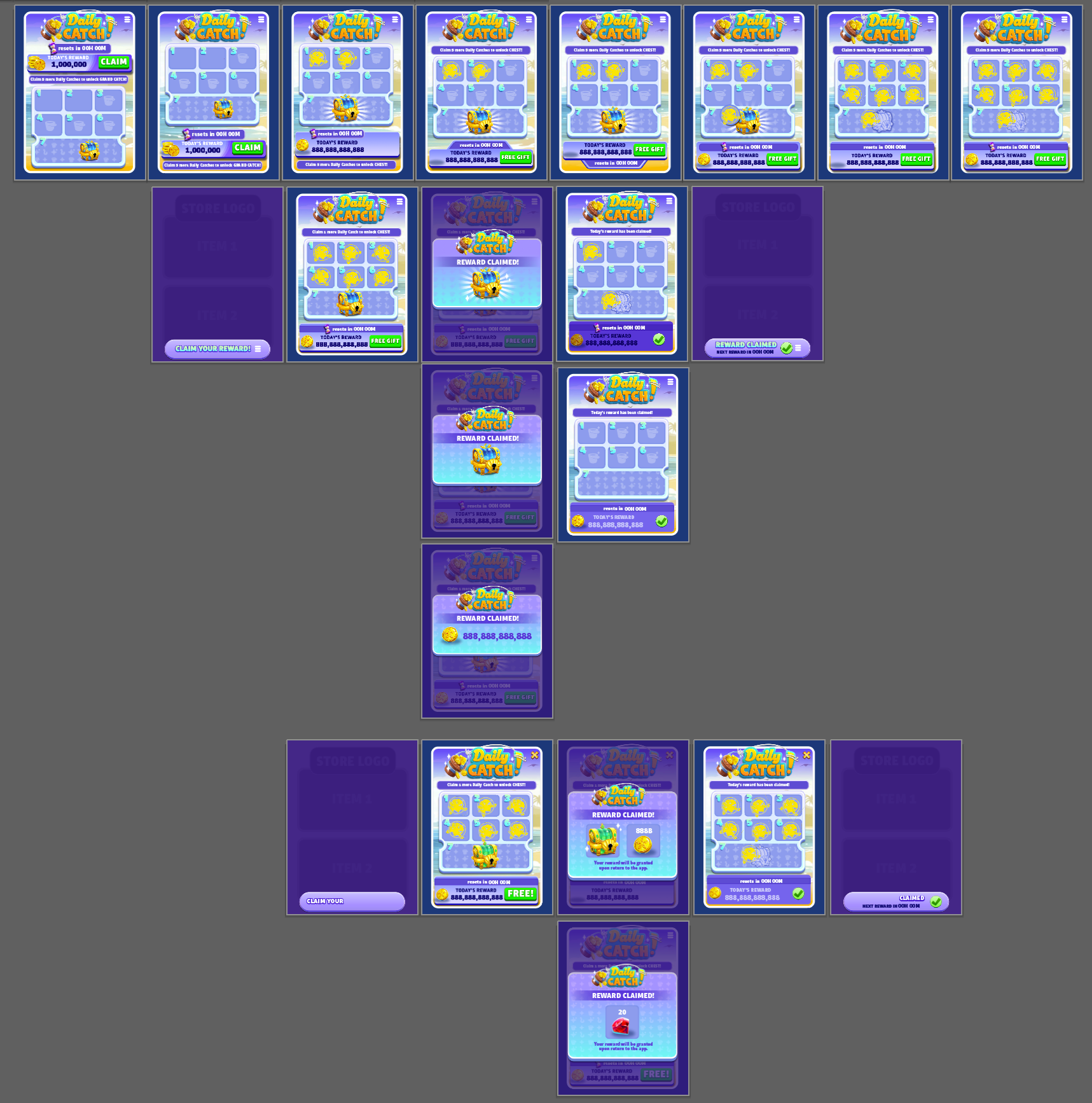
Illustrator artboards showing evolution to final comps
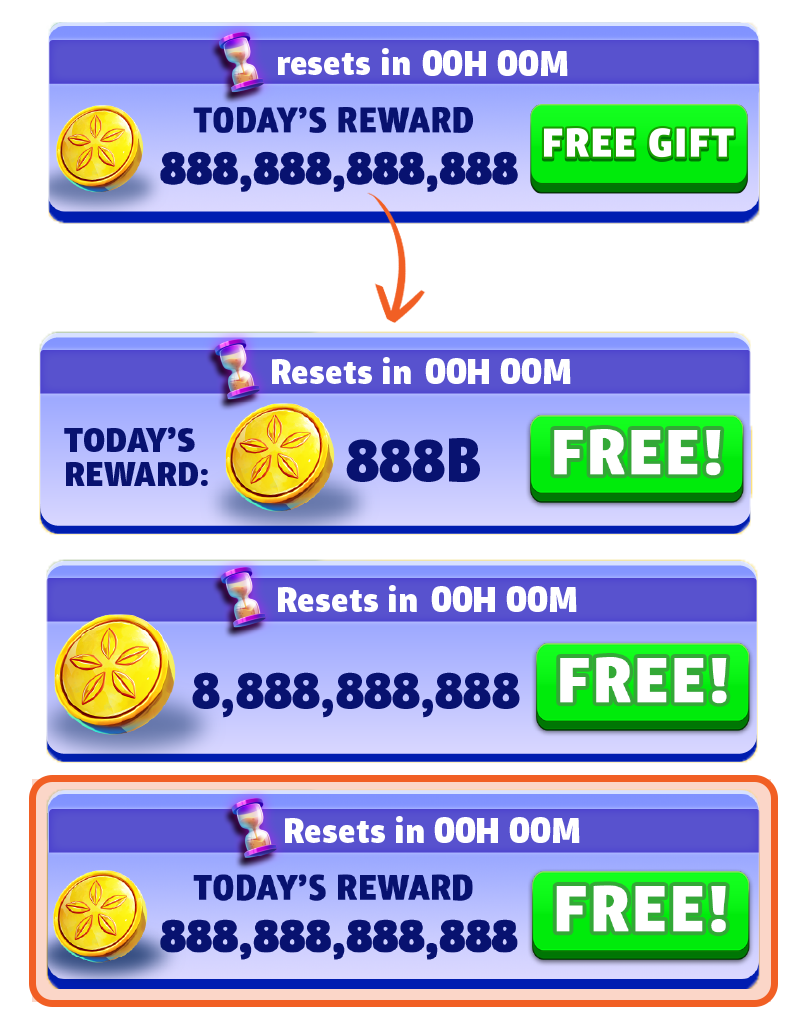
Currency type and icon layouts
Grand chest claimed states
Explorations of inactive reward bar states
Layout and reward claim state iterations
Final portrait screens after feedback from PM, QA, and teamwide playtest
FINAL Designs
03
Playthrough on portrait mode

Hero imagery created in a multi-step process using Blender, Photoshop, and Illustrator.
In-app reward popup matching existing game currency bar, branded with the Daily Catch logo
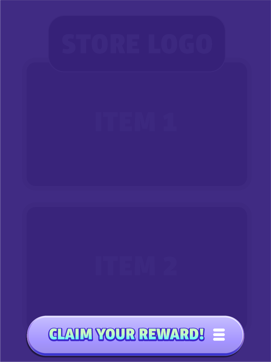
LIVE OPS Collateral
04
Custom live ops assets to be surfaced at launch to introduce the feature to players seamlessly in-game, Collaboration with Devin Lawson, art manager