
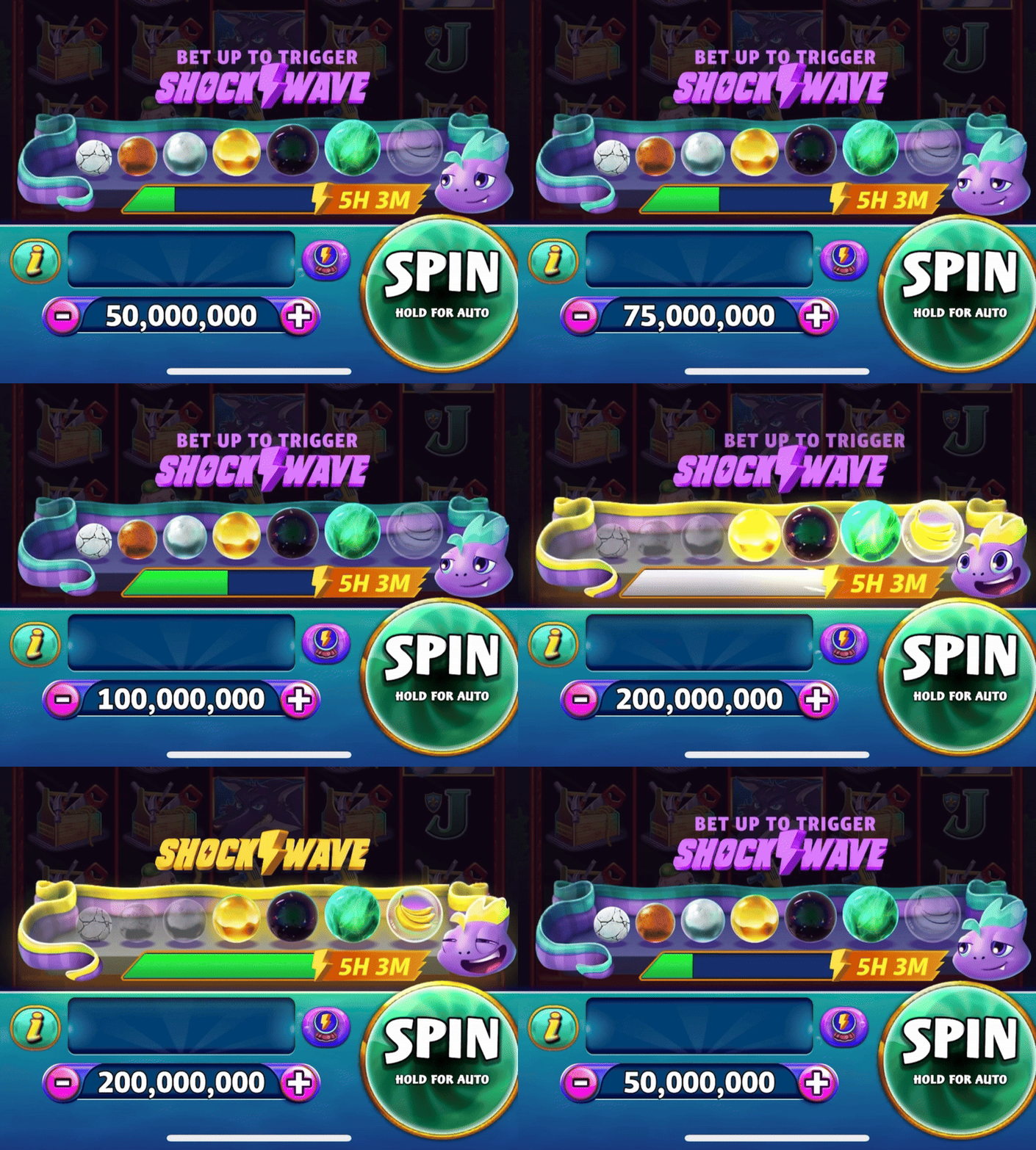
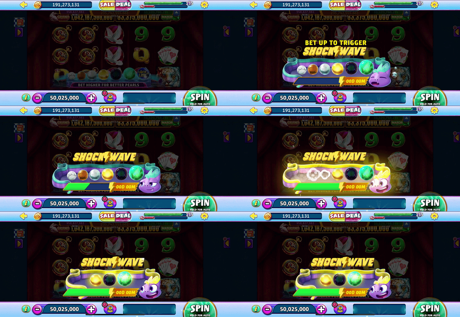
FEATURESHOCKWAVE is a Live Ops system rewarding higher bets with better odds; brought to life by an electric eel that literally sparks joy.
Increasing revenue during live ops events requires increasing average bet and spins without negatively impacting long-term retention.
The game does not have events that give players a choice to participate without punishing them if they do not, creating hesitation, reducing player confidence, and ultimately, generating less spend.
The challenge is to design a clear, opt-in feature that visibly improves reward odds as players bet up for higher coin-in without a drop in engagement.
PROBLEMBy progressively removing lower-tier rewards, the value of higher bets becomes immediately legible, reframing betting up as a transparent upgrade rather than a hidden risk. ShockWave transforms betting up from being perceived as a risk into a clear, playful mini-game experience that the player can control, encouraging higher bets and spin activity, and in turn, long-term player engagement.
An affable character shifts the act of betting up from uncertainty into confidence by surfacing improved odds in real time.
SOLUTIONUI/UX Designer - responsible for the design of features within the team, including concepting user flows, designing branding, and final asset hand-off. I shared responsibilities and collaborated with another designer, Zig Sanders, whom I handed off the project to when I was shifted to another feature, as well as the Product, Engineering, and QA teams.
ROLETools
Adobe Illustrator
Adobe Photoshop
Figma
Blender
Timeline
8 weeks
Project
DISCOVERY
01
USER FLOWS
KEY COMPONENTS
INITIAL FLOWS
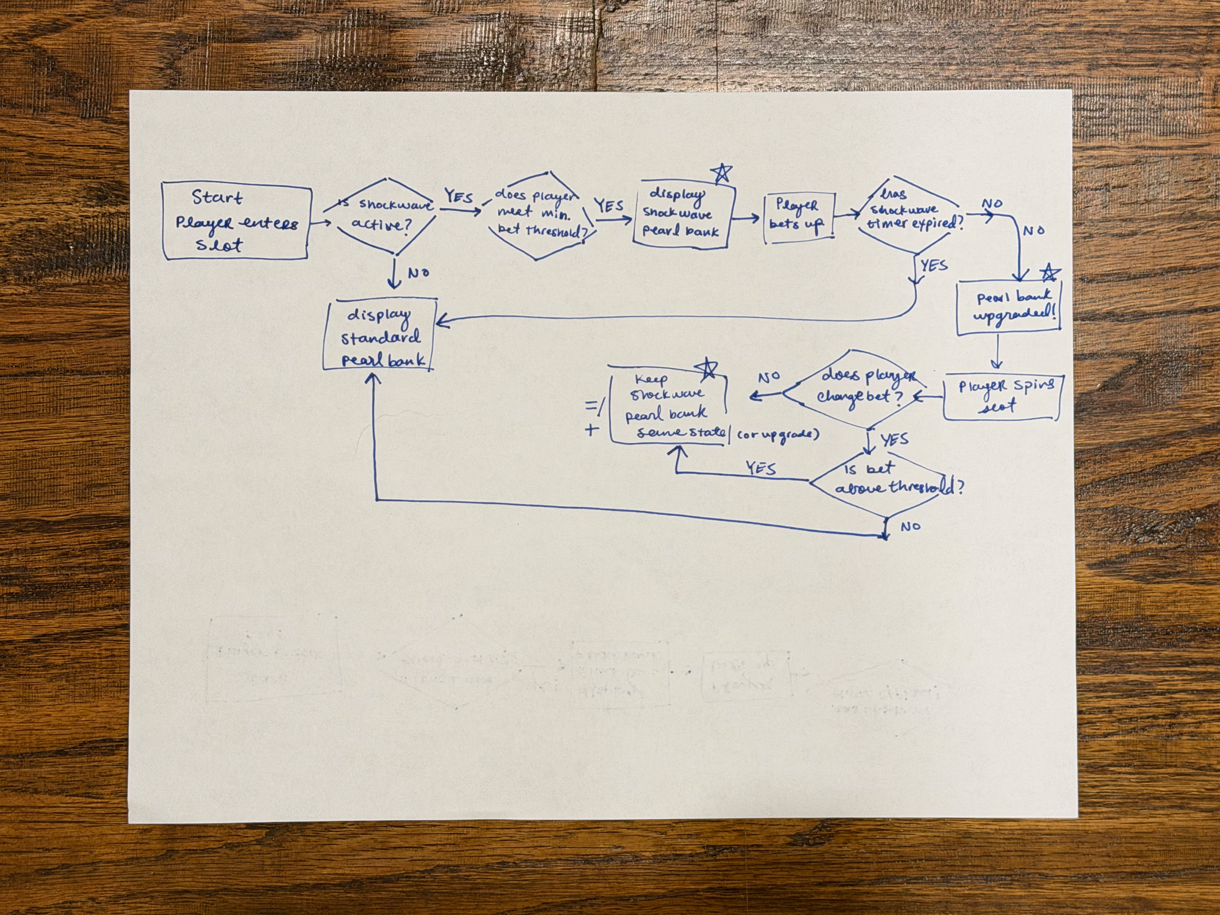
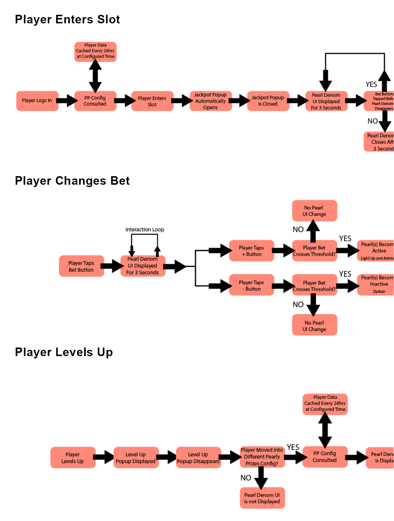
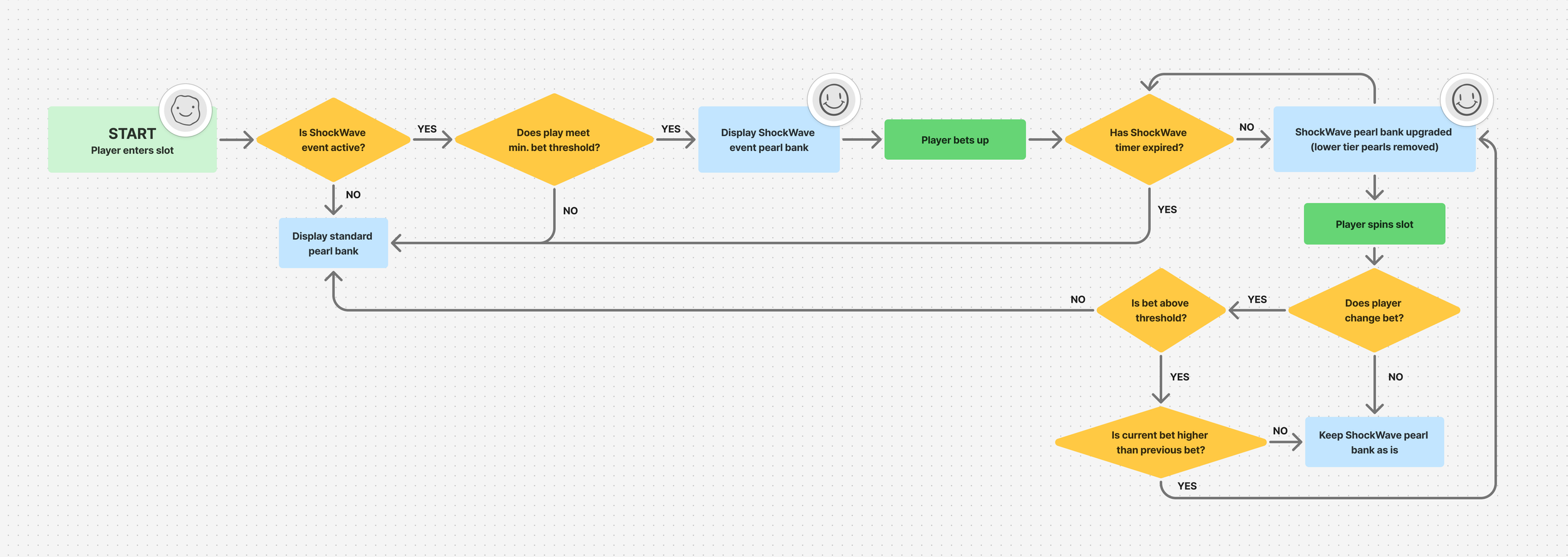
To kick off the ShockWave design process, I mapped a user flow outlining how players enter, qualify for, and progress through the event across bet states based on the feature spec. I reviewed the flow with the product owner and engineering team to ensure alignment with technical requirements before moving into wireframing. This process ensured all key moments were captured early and surfaced opportunities to introduce narrative beats within the mini-game experience. I designed the flow with three goals in mind:
Encourage players to bet higher
Clearly demonstrate the cause and effect of bet behavior on rewards
Ensuring consistency with the existing Pearl Bank mechanic including resizeability
Character design that is native to Gold Fish mascot lineup
Dynamic character animations to indicate states
Supplemental non-character iconography
Landscape and portrait mode support to be compatible with existing Pearl Bank
Branding
KEY COMPONENTS
Character + Logo
Progress bar with clear visuals and messaging to indicate states to players
Timer and action copy in a legible, at-a-glance layout
Landscape and portrait mode support to compatible with existing Pearl Bank
Branding
Progress Bar + Bet UI
FINAL FLOWS
BRANDING & CONCEPTs
02
LOGO & ICONOGRAPHY
SKETCHES
MOODBOARD
ANIMATICS
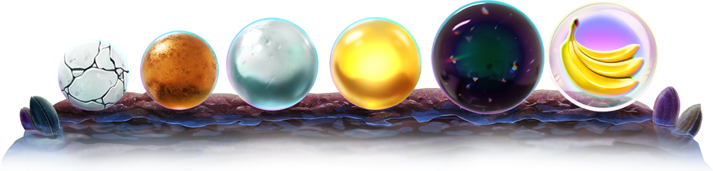
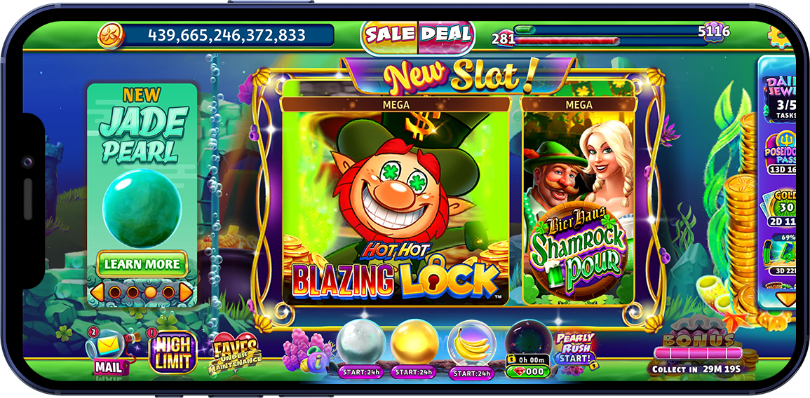
Existing Pearl Bank design
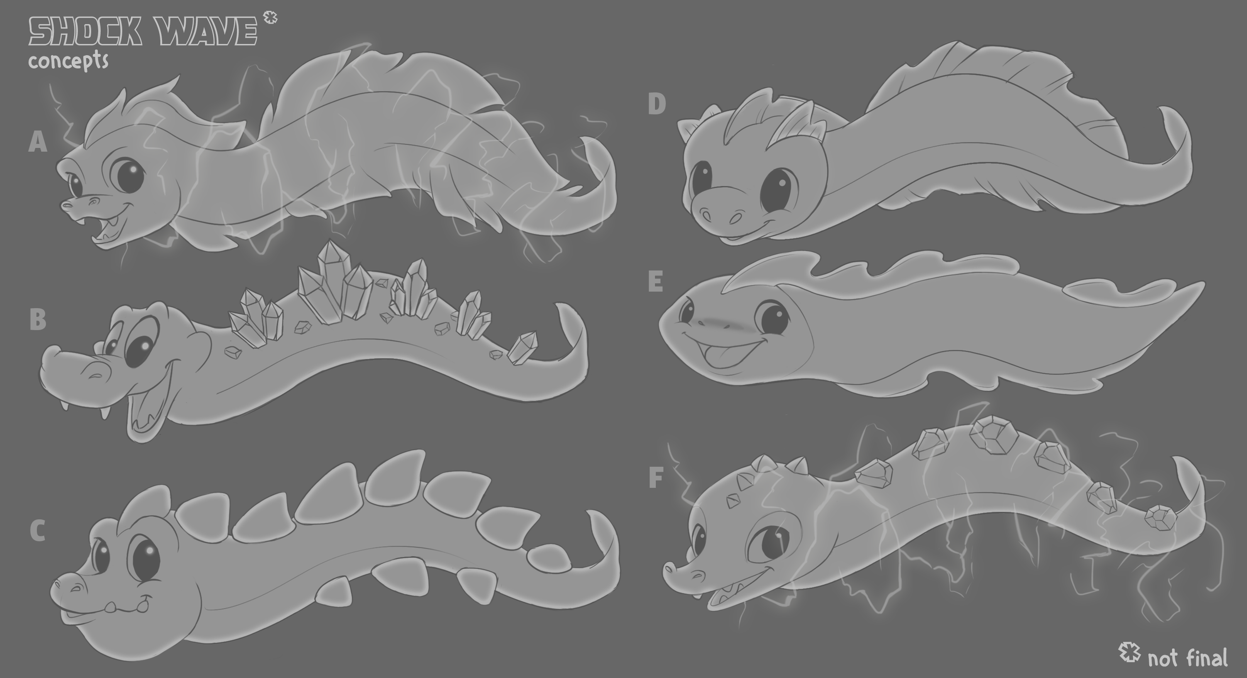
Concepts spanned from pelicans mischievously scooping up pearls and seals playfully headbutting them, while hermit crabs pilfered them into their capacious shells, to more abstract wave-based graphical meter representations.
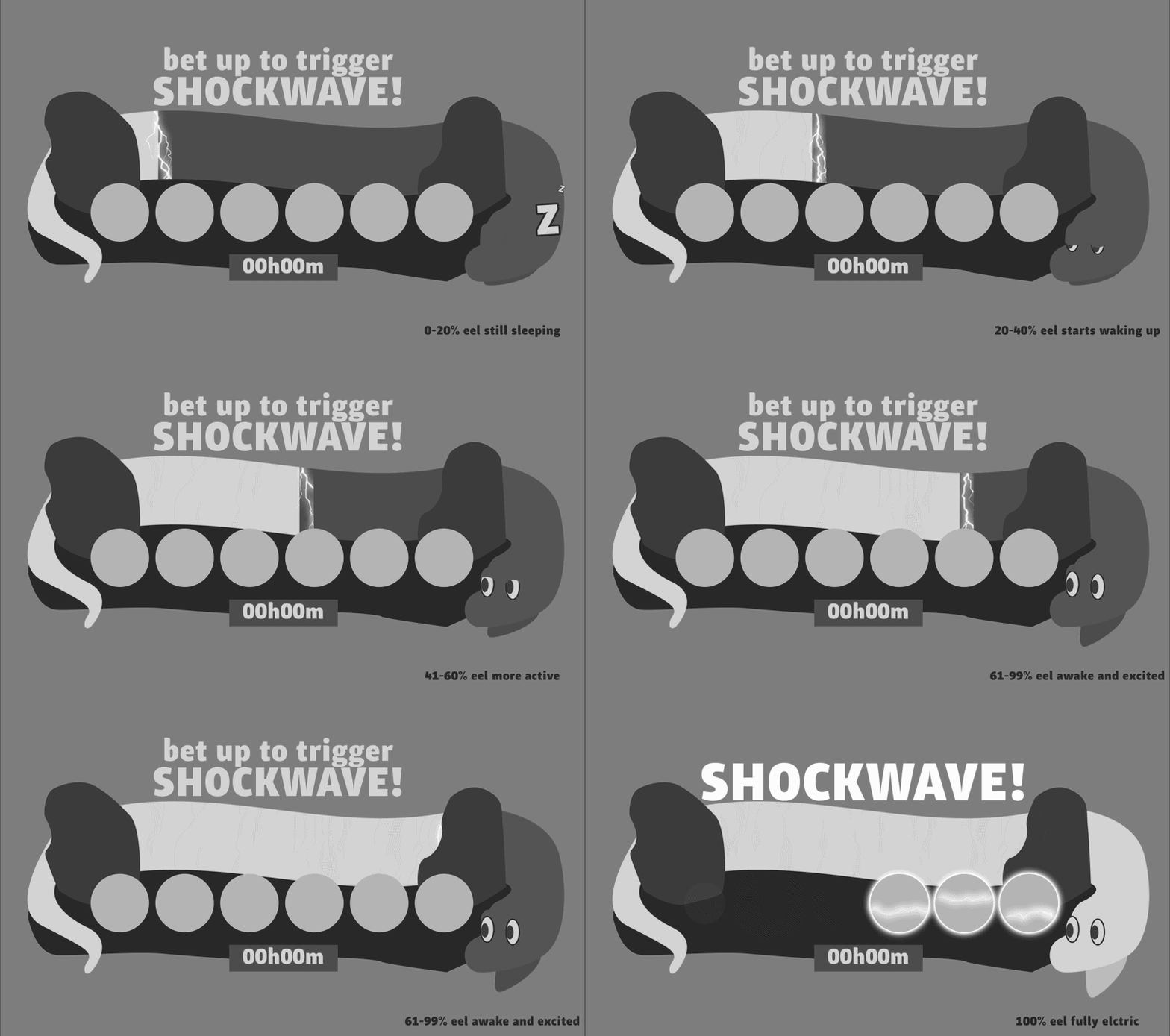
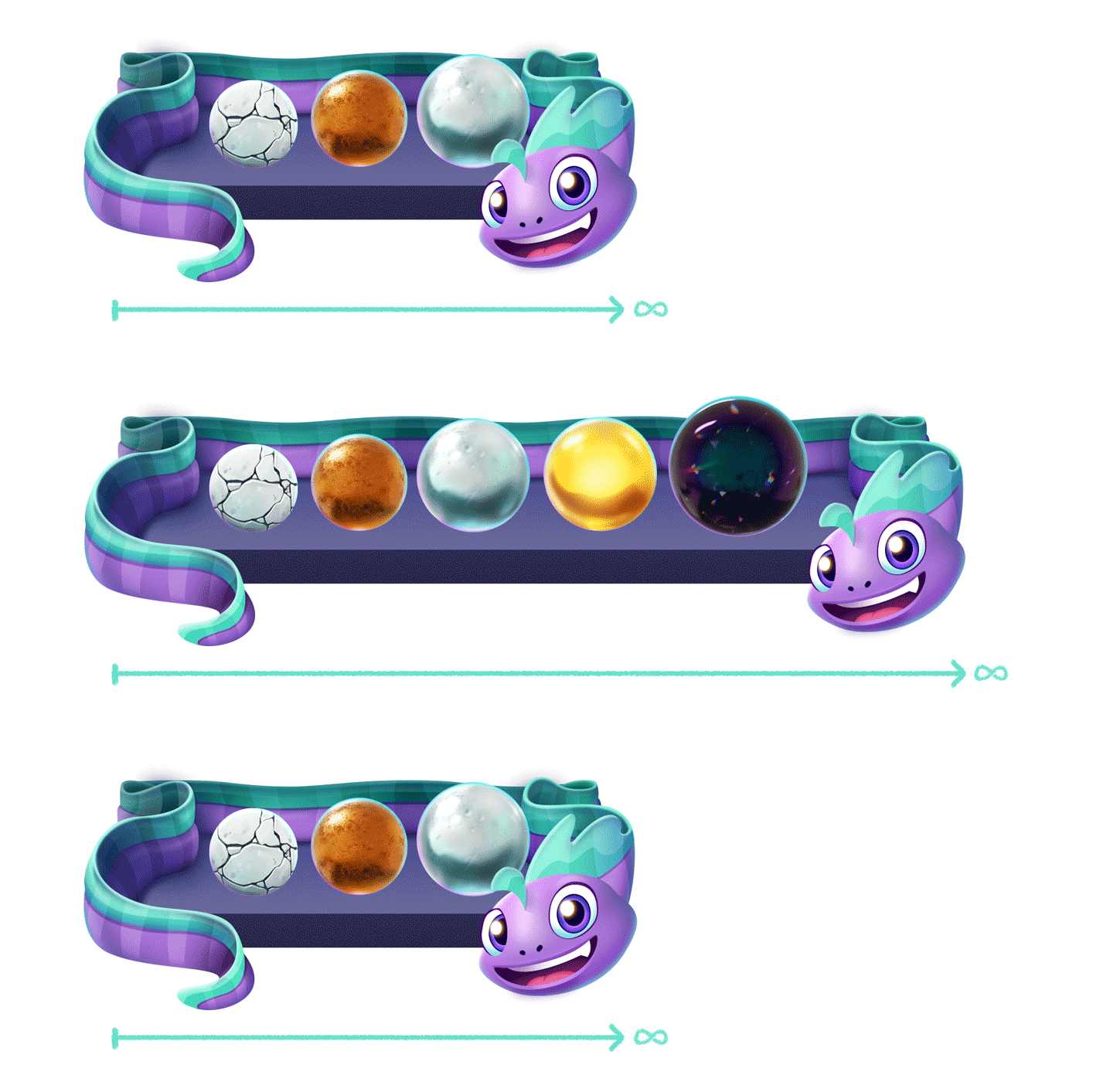
The team ultimately aligned on a direction that prioritized dynamism, resulting in an electric eel concept designed to animate instantly in response to player input on the + and – bet controls.
This would allow the feature to feel reactive and expressive, while the eel’s serpentine body would accommodate dynamic pearl counts and seamless transitions across different orientations.
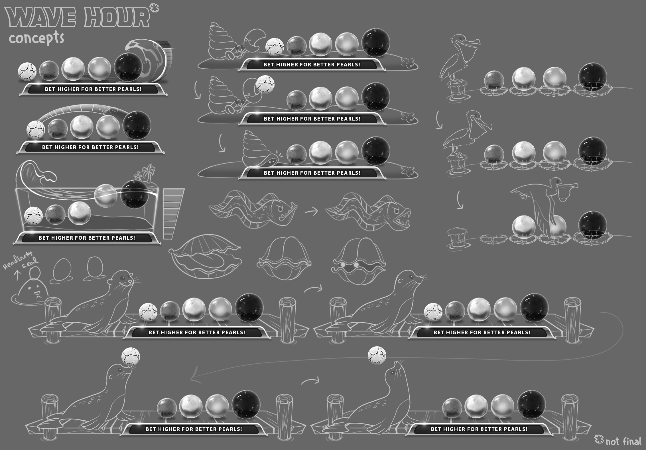
Early creative discussions focused on how to integrate the feature in a way that aligned with Gold Fish’s playful underwater world while also ensuring consistency with the existing Pearl Bank design. The team aligned on introducing a new character to the ecosystem to provide a light, narrative layer to guide the player toward the desired behavior while retaining the dynamic scaling/resizability of the original Pearl Bank.
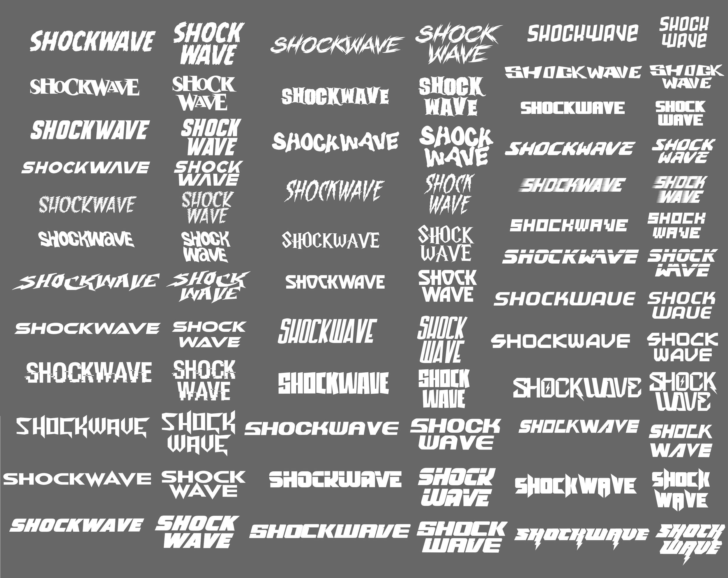
Naming exploration centered on evoking urgency and limited-time participation, with the team narrowing it down to Wave Hour and ShockWave, with ShockWave ultimately selected for its energy, immediacy, and brand fit.
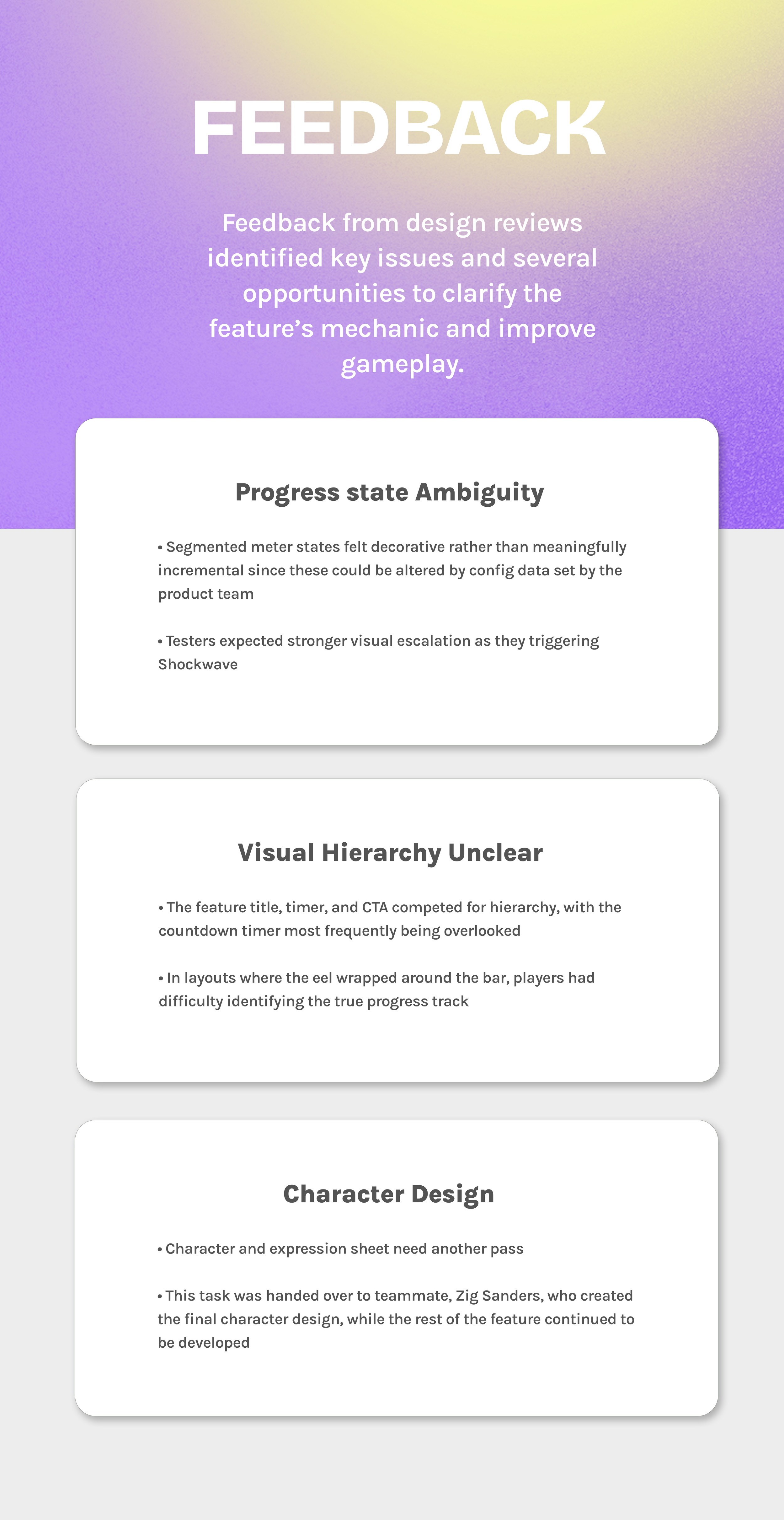
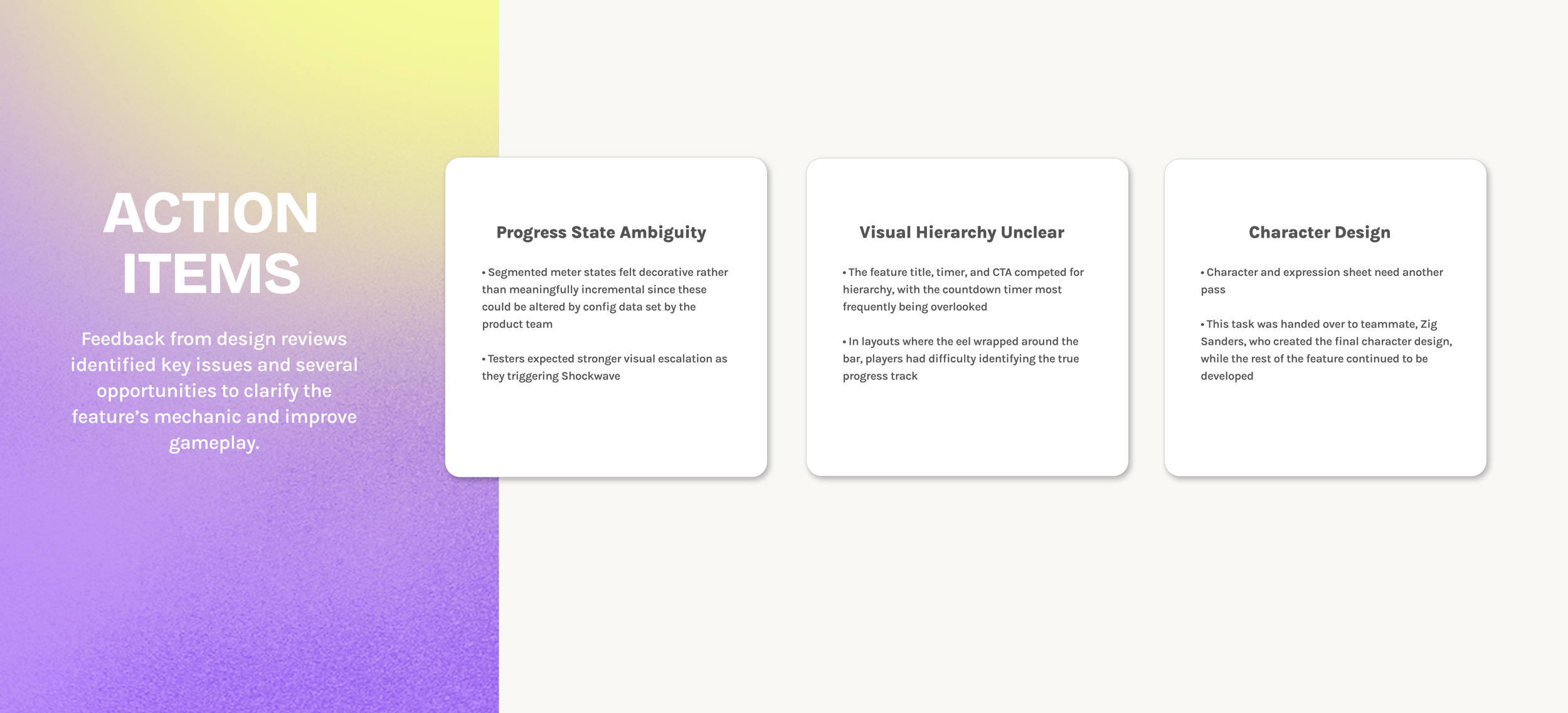
FEEDBACK
CHANGES
PLAYTEST
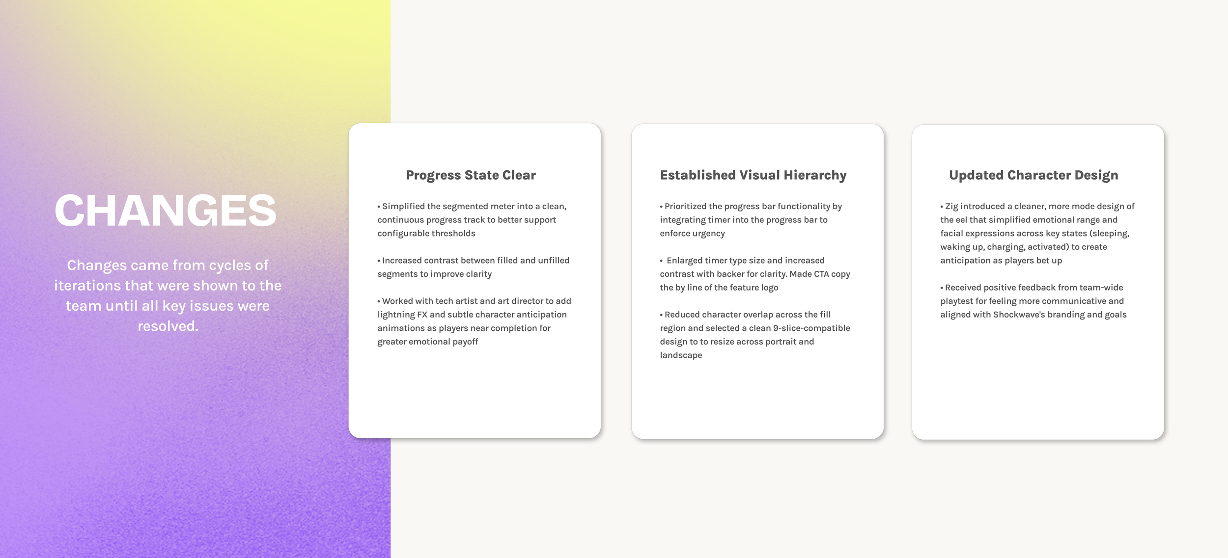
FEEDback & Iterations
03
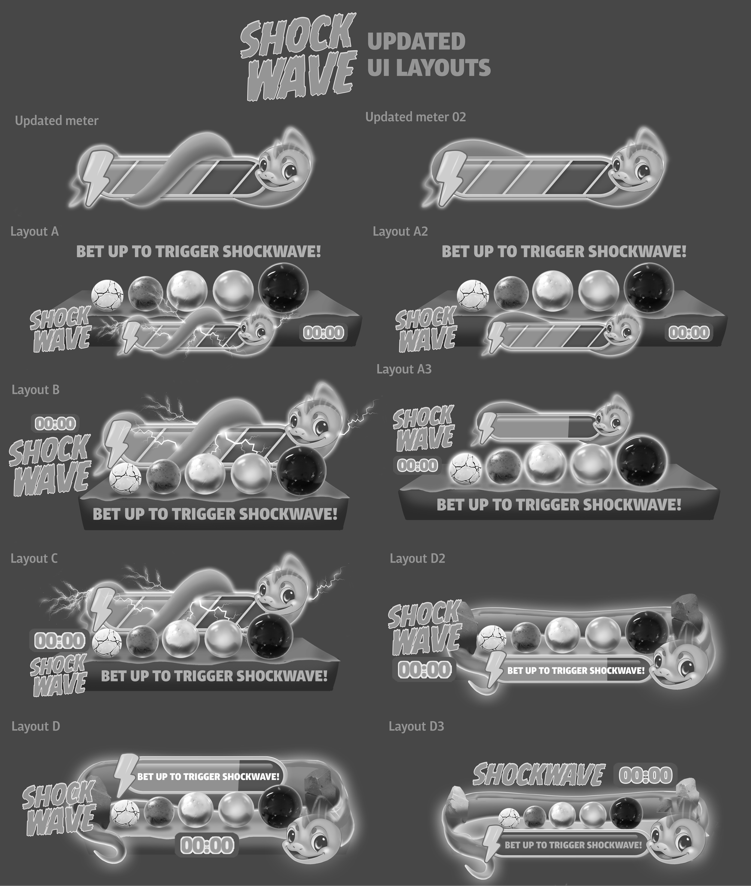
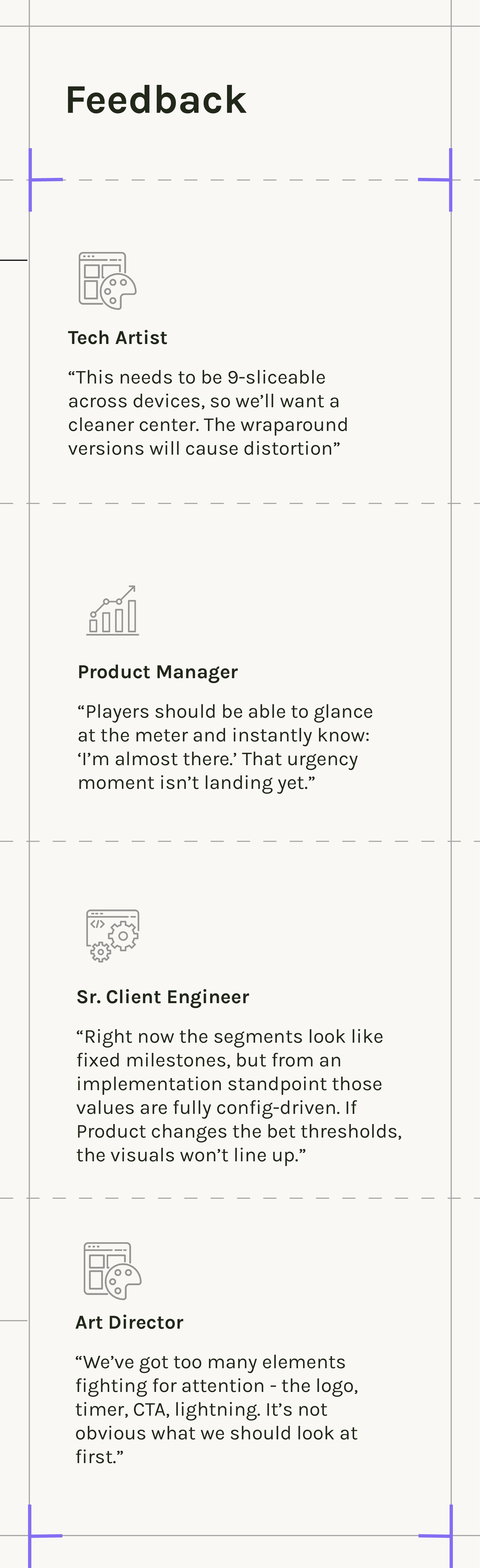
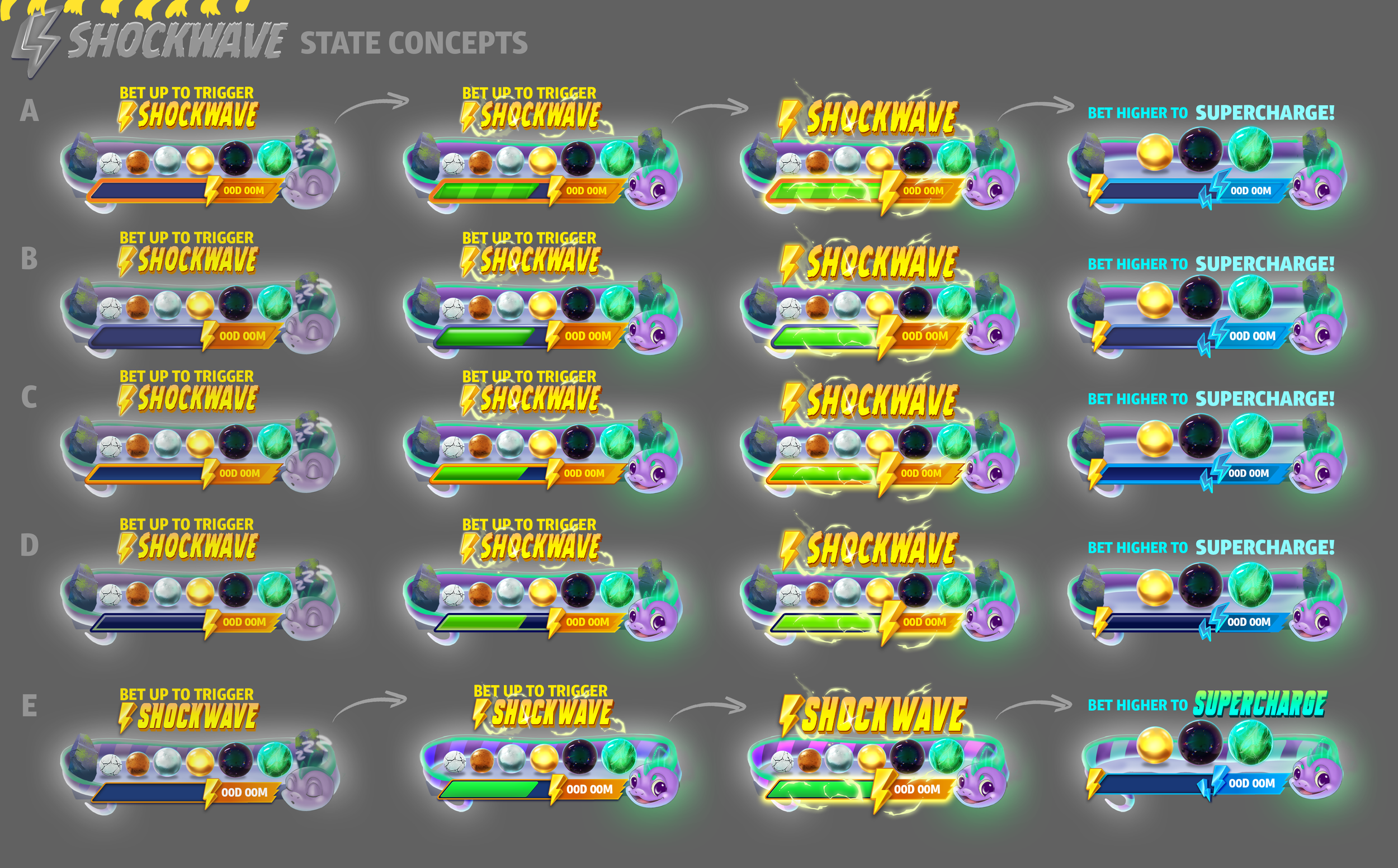
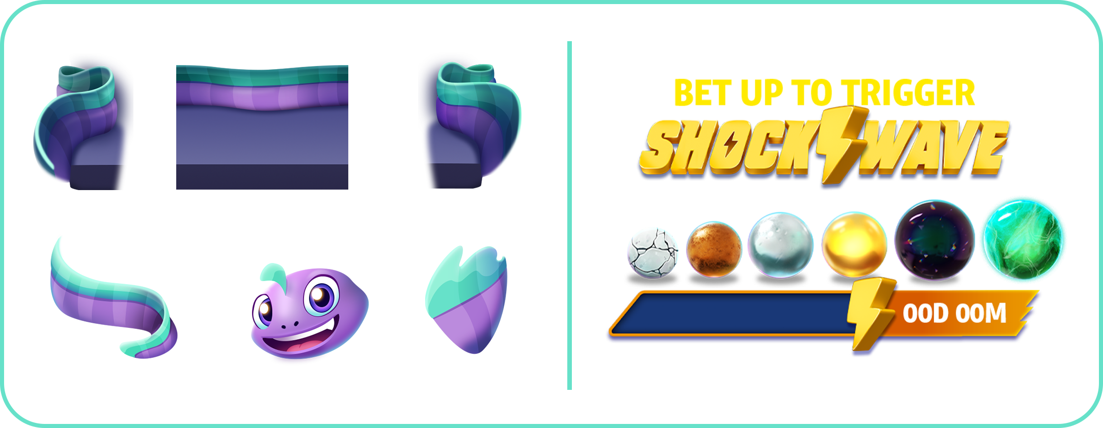
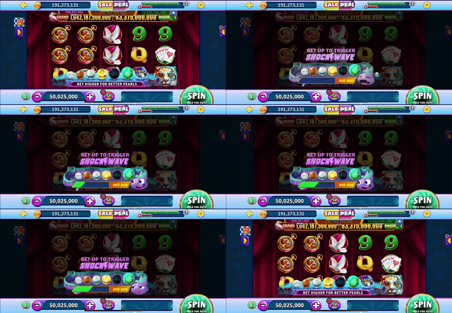
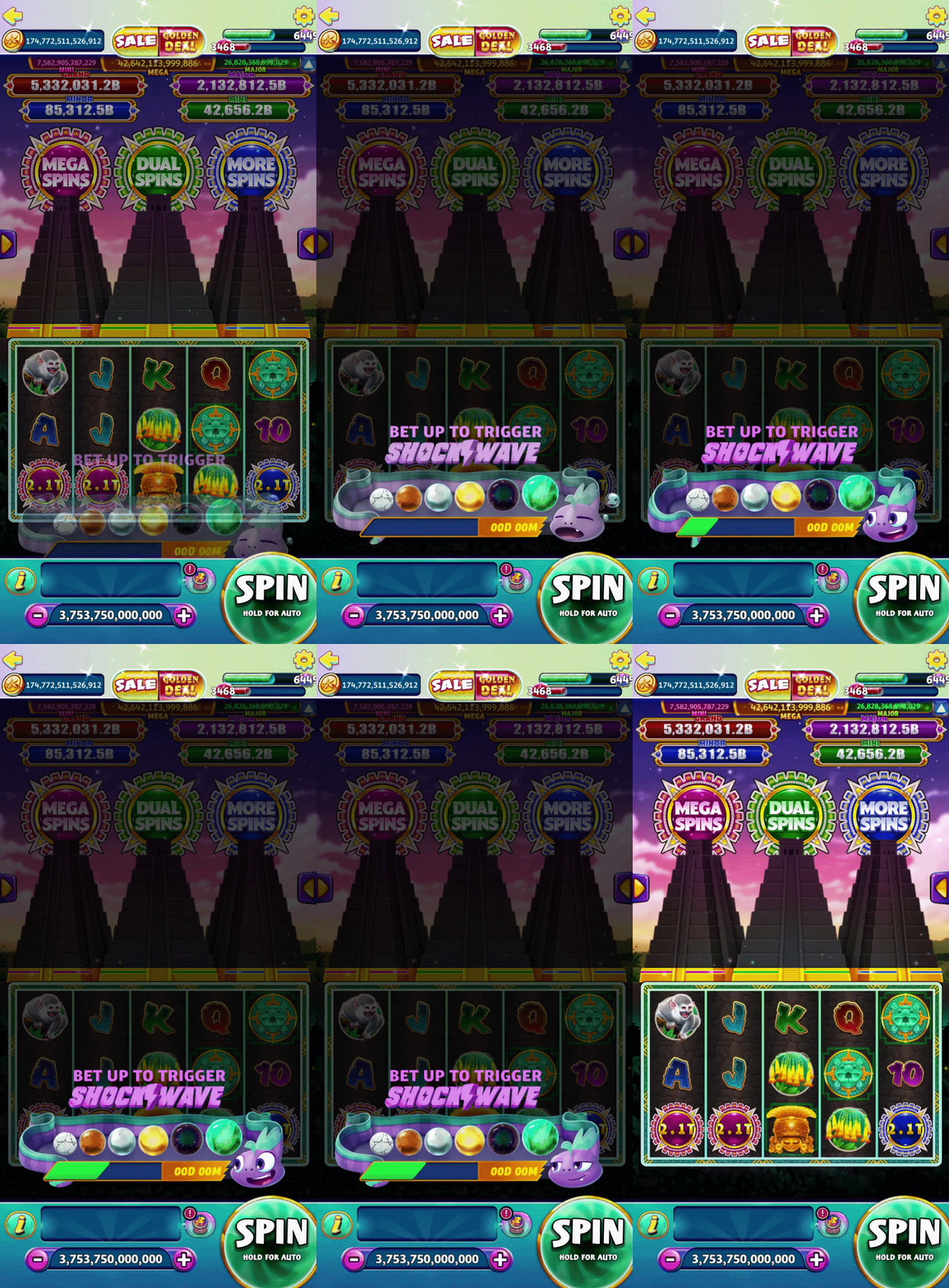
I explored a range of layouts for the ShockWave meter to figure out how the eel, timer, logo, messaging, and progression meter could all coexist within the pearl bank’s extremely limited UI footprint at the bottom of the slot. The eel’s serpentine shape became a strong foundation for the system, allowing the feature to feel reactive and expressive while naturally accommodating dynamic pearl counts and seamless transitions between portrait and landscape orientations.
A major focus during this phase was balancing personality with readability while considering portrait-mode compatibility.
While the eel itself was intended to feel lush and emotionally engaging, the surrounding UI was intentionally kept simple and clean to support quick scanning during gameplay. These explorations helped test hierarchy, scalability, and responsiveness while ensuring the feature remained visually exciting and kept the core game mechanism intact.
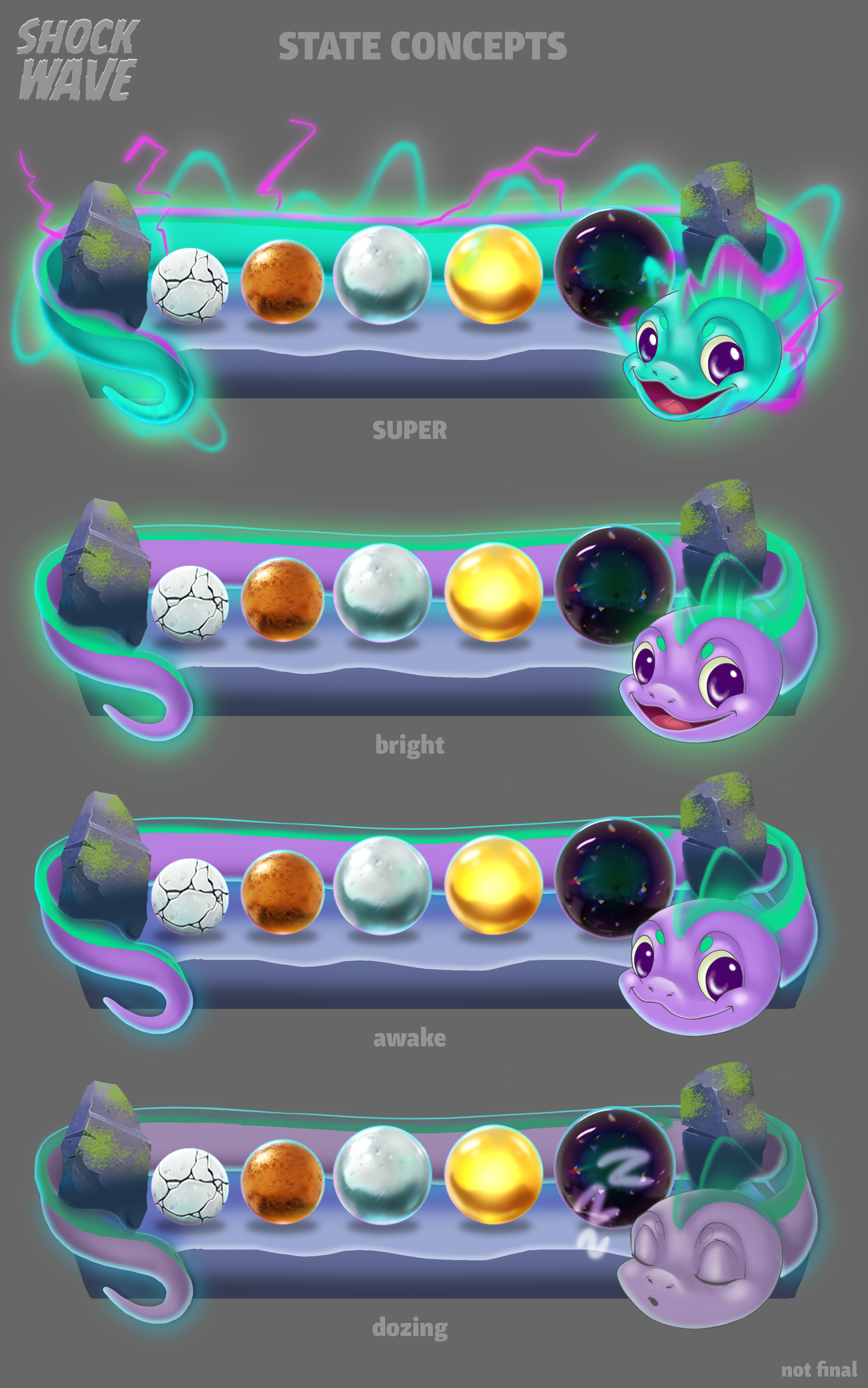

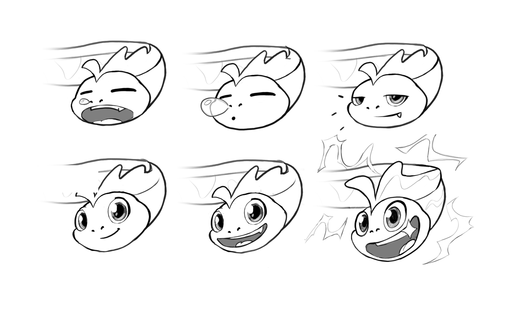
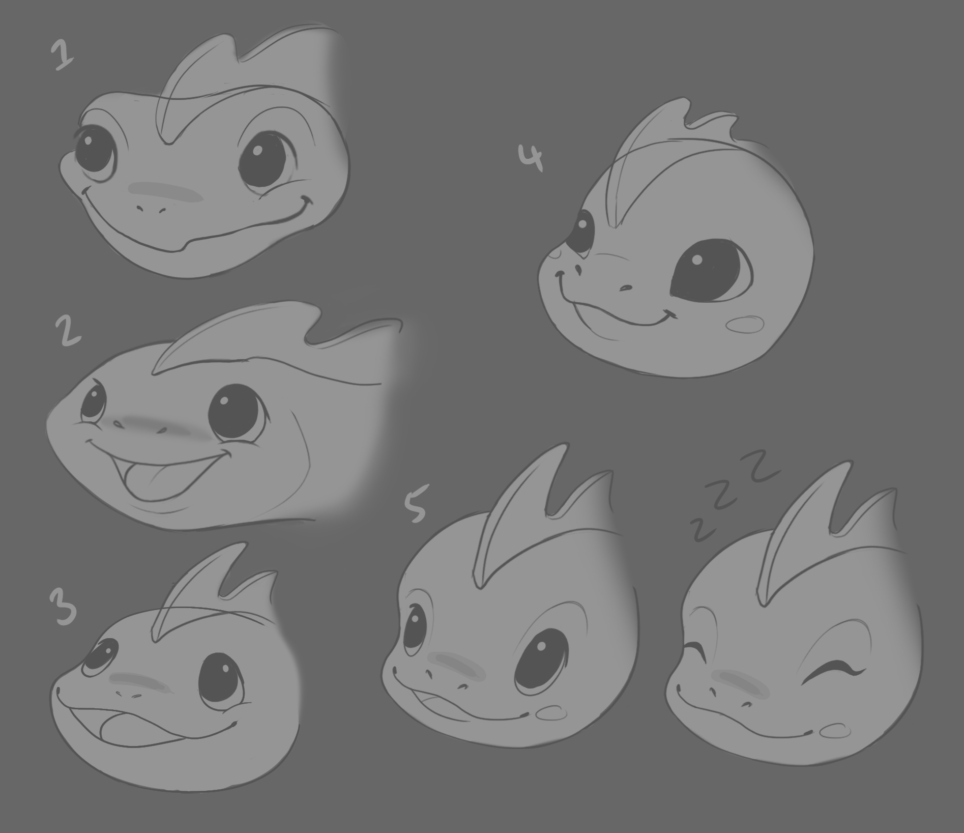
Zig’s updated character expression sheet


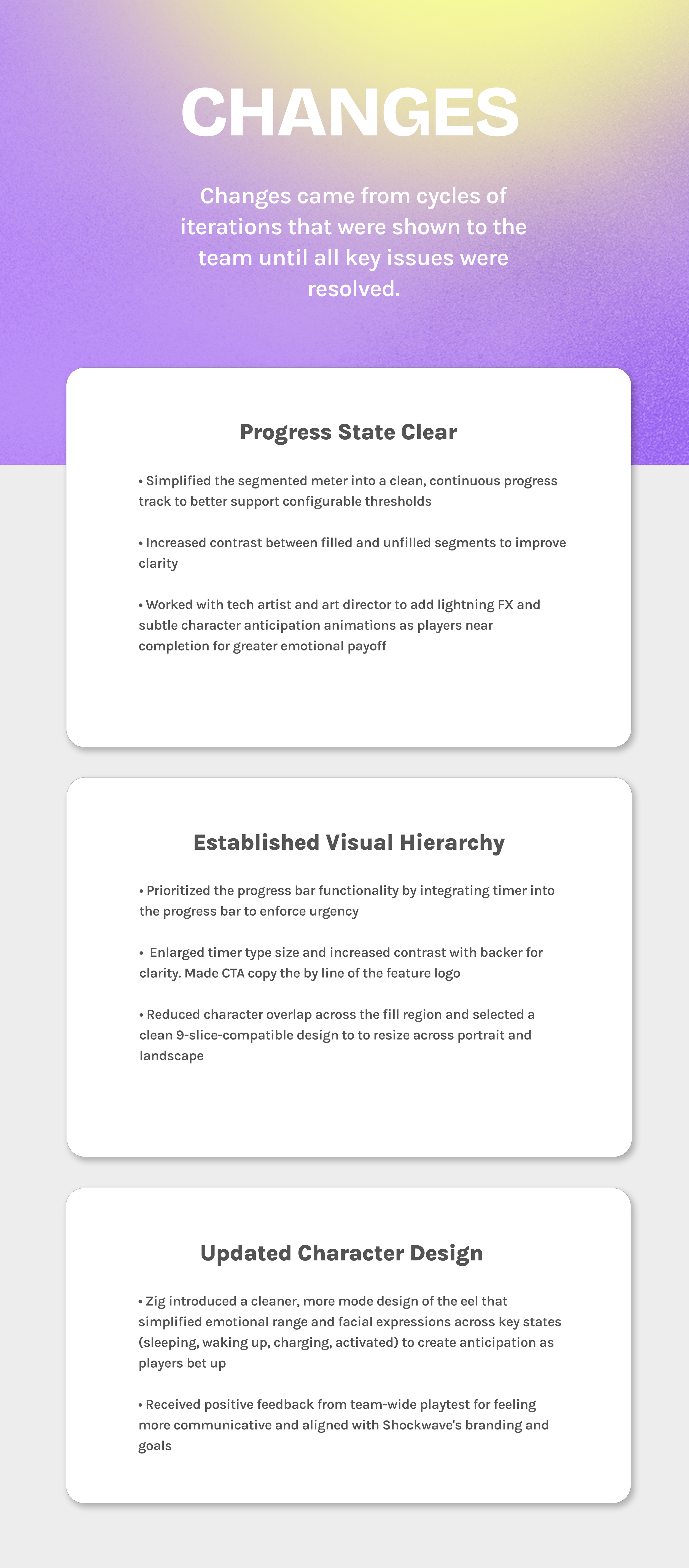
04
FINAL DESIGNS

05
LearNingS
My time on this feature reinforced that strong feature design isn’t about individual ownership but more so about assembling the right strengths at the right time. While I established the initial character direction, partnering with Zig allowed the eel to evolve into a cleaner, more expressive, and better-integrated design. His refinements strengthened not just the narrative but the overall polish of the feature.
I learned that:
Early exploration is never final - it just needs to be directional
Inviting specialized expertise can significantly raise the ceiling of a feature
Letting go of authorship in favor of collaboration leads to a better player experience
Most importantly, this experience reinforced that successful feature development is iterative and collaborative. Staying flexible and outcome-focused ultimately leads to stronger design. As such, our team delivered a version of ShockWave that felt more cohesive and polished than originally envisioned.